Transcript
Welcome, everybody. I am Bettina Winkler from Visiopharm, and I would like to welcome you to a new master class series for spatial biology.
Today, we’re kicking off the series with our own doctor Fabian Schneider, who’s responsible for product management of our research products.
Fabian has a doctorate in cell biology and over ten years of international experience in cancer biology and immuno oncology, working in academic research labs, clinical research teams, and computational pathology groups in both academia and biopharma.
He’s kicking off our series with an introductory talk about the hows and whys of spatial biology.
During the next month, he will be followed by researchers around the globe showcasing how they use spatial biology to advance their research.
Fabian will answer your questions after the talk, so please add any questions to the chat.
Fabian, over to you.
Thank you very much for the kind introduction.
And let me kick off this webinar series with mapping the biological landscape, turning images into knowledge.
Maps have always been a tool for humans. And since the early ages, we already tried to map the world around us and put it on paper so that we can communicate our surroundings with each other and that we understand where we are and where we want to go.
And throughout the centuries, we got better and better in mapping our world and understanding where we live.
And today, we have all the tools at hand in our browser so we can explore the whole globe. And even in fiction, like when Frodo wants to walk into Mordor, it’s always good and handy to have a map so that you know which obstacles are on your way to get there.
Frodo and the fellowship of the rings would have been really happy to have an interactive map of Middle Earth as we have today with a lot of annotations by users and giving a rating of sides so they could evade some dangers to get rid of the one ring at Mount Doom in Mordor.
We could use tools today to just throw an in digital dart and see where it has landed.
Let’s assume we want to plan a trip towards where our dart has landed.
Now we know this is in Northern Europe. This is in Denmark, close to Copenhagen.
The further we zoom into the map, we can now start to understand the surroundings of where our dot has landed much better. So now we know it’s in region sealand where Copenhagen lies. The closer we zoom further in, we now see smaller towns that are surrounding Copenhagen, like Roskilde or in the north. We have Helsingborg on Sweden and Malmo in Sweden.
Zooming in further, we now start to understand the vessel system of Copenhagen with all its biggest streets.
The further we zoom in, now we can understand all the different quarters and larger structures structures have been added to the town, which helps us to navigate, like, where is the supermarket or where is the park to go for a walk with your dog. And even there are specialized annotations, like finding Luke’s Bar, the best cocktail bar in Copenhagen.
Planning the trip, we now need a hotel.
So we can ask for the annotations of hotels, and we find already these across Copenhagen, even already phenotype with pricings so we can find the right hotel that fits to our budget.
And a pathologist looking at a tissue slide might ask, what is in my tissue and what tissue architecture do I see?
Next, I would like to know for the trip, like, where are the bars to go out at night?
And the pathologist might ask, where are immune cells within the tumor sample I’m looking at? And do I find immune cells?
I would like to phenotype my bars even further and ask, like, where are bars that play hard rock music?
And how are they related to each other?
And similar pathologists might ask, like, how are the immune cells distributed within the tumor, and are there different kinds of immune cells that I can already identify?
So working with maps and tissue samples is very similar, and we are trying to understand patterns in terrestrial as well as in tissue images.
So if you review the location of the town, this is similar to a slight overview you have to do with a pathologist and a biologist in the beginning when you look at your sample.
We can also look at building densities per area if you’re interested, for example, in where to buy a house, and this is similar to the overall cellular content.
And we can also correlate the housings to where do the most people live, and this is similar to, for example, where are tumor nests and where are dense regions of, cells.
Looking at the tissue slide, pathologists can easily identify a lot of structures like low balls or adipose tissues. We can see stroma. Blood vessels are easily to be identified and also tumor tissue.
At high magnification, we can see single cell object within the h and e slide.
And now we can already based on the shape and the morphology of these cells and the staining patterns, we can already identify several cells. So we can identify lymphocytes based on their high intensity for hematoxylin and their roundness.
We can identify the elongated nuclei of endothelial cells around lumen.
We could see collagen fibers in the stroma, and we can identify cancer cells.
But one does not simply identify cell types and their functional states with high confidence on an HNE slides without biomarkers, so we need multiplexing.
So spatial analysis in general is a data analysis that deals with data that are geographical and have a spatial component like an x y coordinate.
It involves the use of statistical and computational techniques to study patterns and relationships in data.
Spatial analysis helps you to uncover location based insights and by overlaying maps with layer locations and business data similar to annotations.
And examples are geodata such as our Google Street View, our the map example I gave, like, with satellite images, GPS coordinates, we all use to share locations where we are so we can find each other more easy.
And when we combine all of the views that I’ve shown before and you analyze town districts or maps, then you’re already multiplexing in your daily life.
When we look at these two images, they could both come from a satellite. But the right one is a multiplex IF image of a tissue section, and the left one is a region segmented and compartmentalized satellite image of woodlands and, agricultural areas of Earth.
And there we already see that these two are very similar and that we can apply the same techniques on both modalities.
The success of cancer immunotherapy has given a boost for spatial biology analysis.
The breakthrough designation of the cancer immunotherapy by Science in two thousand fourteen has already led to rapid growth in the field. And now a lot of these very nice images are on the cover pages of various high ranking journals. But still, the analysis of the samples is varying a lot.
Spatial biology analysis has a variety of things that are associated with it and that come to mind.
There is multi omics. There is cellular neighborhoods. There is immunofluorescence, RNA transcriptomics.
We have single cell, but we also have phenotyping, and a lot of brands and assays are coming to mind.
The tissue samples can be analyzed by various methods of molecular analysis. Like, we can dissolve the whole tumor and look at the bulk RNA sequencing data.
We can also dissolve the tumor and look at the single cell RNA sequencing data, or we use classical pathology, histopathology, and look at spatial proteomics and transcriptomics on thin cut sections, which is completely different to the single cell analysis that can be acquired in facts analysis or RNA sequencing of single cell data because we are looking only at parts of a cell in a in a section as most cells have a diameter of around ten microns.
The data are also quite different that we get out of these, sample preparations.
In bulk RNA sequencing, we look at the gene expression counts per sample, while in the single cell RNA sequencing, we get single cell data.
And in the spatial proteomics and transcriptomics on slides, we add to this per cell expression count data. We also add the two dimensional x y coordinates.
And this gives us advantage over the other two methods because now we can study also the tissue architecture and the cell cell communications, which is not possible in single RNA sequencing or bulk RNA sequencing.
With today’s assays and also hardware, we can now also start to combine spatial omics data, like transcriptomics and proteomics for advanced tissue insights.
To combine the data on a cellular level, you need to core adjust the these different modalities, like here in H and E with the GeoMx DSP IF image. But we can do more with our tissue line add on. So you can also core adjust the Lunophore multiplex IF images with Hyperion standard bio tools, mass spectrometry imaging, or also with agent E and other bright field modalities.
This allows you then to combine the various sizes and resolutions, but you can then also transfer your deep learning based tissue detection from agent e, for example, onto the multiplex IF or vice versa and do transfer learning.
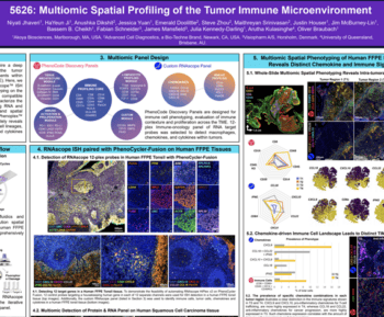
A great application of that multimodal tissue line of the Visiopharm platform comes from Semifery Borjono at MD Anderson.
Here, they subsectioned into consecutive sections ovarian cancer samples and performed, multimodal assays on each of these sections.
So the center section was done with a Lunaford comet assay.
The section above was done with a Bruker mass spectrometry imaging to, analyze for metabolites, and another section was used for a stomach’s gene expression data.
Now all of these modalities have a different resolution. And from left to right, we go from high resolution about a quarter of a micrometer per pixel to twenty five micron per pixel on the right with the stomach’s gene expression data.
We were able to align these images and coregister and then transfer the tissue segmentation mask from the lunar four comet image onto the other images.
And this allows, Sami Ferri, Borjona, and team to analyze better which metabolites are expressed in which regions and how does the metabolites correlate with gene and protein expression.
To collect such data, scientists can choose between a variety of hardware instruments using whole slide scanners, cyclic immunofluorescent devices like LUNOFORCOMAD or PhenoCyclic Fusion by Accoyo or tissue mass spectrometry devices as the Hyperion by SBI or Mevi scope by IonPath.
And we support all of these file formats.
With all of these assays, we want to study the spatial biology and the diverse cellular landscapes in the tissue context. And to do so, we need to identify all cells on a single cell resolution.
We need to uncover the functional spacial biology of every cell and find rare cells, and we want to discover how the tissue architecture is composed and how it correlates with clinical outcomes, for example.
To go from generated multiplex images to biological results of bioinformatics pipelines is often unclear. And sometimes, it appears like a miracle happens in between to get from the data to results.
Data analysis of a sixplex already can result as this panel here, a CD eight focused PD-one, PD L1 access panel, can result in seventeen distinct biological phenotypes. And this is already too much for a manual quantification, so we need a robust analysis pattern.
This panel allows us to answer the most basic questions in immune checkpoint therapy that are related to anti PD one, PD L1 drugs, and panels like this and others are available as ready to use kits from Acoia, Lunophore, or Altivu.
Our Phenoplex product has a complete workflow for all multiplex image analysis needs, offers a way to analyze these images and go from visualization and QCing your essay images to classify tissue, detect cells, phenotype the cells, and then go into verification and data exploration before you publish your data for downstream bioinformatic analysis.
The recent work by Tisson et al in the beginning of this year showed the full Phenoplex workflow where they went from tissue and cell segmentation to phenotyping involving setting thresholds for marker positivity and did a visual data exploration in QC using our built in interactive visualization tools.
The analysis with the Phenoplex results uncovered that ICI induced lesion planus showed a reduction in T cell infiltration and an increase in B cell frequency, and that these b cells are organized in aggregates close to t cells in the inflamed tissue microenvironment.
Generating tissue and cell segmentation algorithms using deep learning requires a biological knowledge about the biomarkers in the samples.
With this, it enables users to generate their own networks and label the structures that they would like to identify, like you, for example, epithelial regions in red and stromal regions in green.
You then, when ready with all the labels, train the networks to identify features and rules underneath these labels to automatically identify these regions once ready, and then you can apply these networks to other samples and identify epithelial and stromal regions.
After the regional segmentation into biological relevant compartments like epithelium and stroma, you then need to detect the cell objects.
And this can be done using our ready to you use algorithms that use DNA stains like DAPI or iridium channels for the IMC images of the Hyperion XTi.
If these ready to use algorithms are not performing as accurately as needed for your tissue samples, you can expand the training so it covers the specific cell types of your samples.
The current cell segmentation algorithms can be expanded. For example, if you are interested in the macrophage population here shown in pink and our cell segmentation does not pick up these objects accurately enough, you can include this channel into your training and then get to a much better and more accurate cell segmentation results of these cells and even other cells.
After you have detected all your cells, the next step is phenotyping.
And phenotyping is basically you are looking at all of your cells. Here, it’s cats, and you want to identify their different shapes and flavors of the fur patterns.
With cells, this looks a bit different.
We identify the white cat as the nucleus, and then we add the biomarker information of these different objects, like CD three, keratin, and they should be also mutually exclusive like keratin and CD three double positive should not exist.
There are several methods how to get to phenotypes, and we have two supervised phenotyping methods in our platform.
One’s changed by intensity and a deep learning based cell classification option.
The intensity thresholding has the advantage that it’s very fast to generate biomarker positivity and can be used very intuitively by our scientists. The disadvantage is that with mean intensity of the objects or the object compartment, the results can become incorrect with non accurate cell segmentation results, as with when the cells in the tissue are overlapping.
With deep learning networks, you have the advantage that the training becomes more robust in the network, and it can deal with the variance like cell size, shapes, the autofluorescence, distributions, and also intensity variations.
The disadvantage is that here you have to add additional work to label the input data for the networks for all the different biomarkers, and it’s more runtime intense.
Here, I focus on the interactive gating workflow, which allows for a fast and intuitive, supervision of cellular phenotyping.
Each biomarker channel can be gated in a histogram, and all changes in the histogram are visualized on the images on the left.
You can then also switch on your tissue segmentation to identify where are these cells located within the tissue.
If you zoom in, you then can see that it has identified the sign positive CD8s in most of these, samples correctly, while in the top left one, it’s also identifying background positive epithelial cells.
By changing the gate for this sample, we can then identify only the CD8 positive objects and get rid of the background noise in the epithelial region.
To verify and to see the results that you have generated from the gating step, the co occurrence matrix is a great tool to trust your results. Here, you can review each biomarker as a column and a row and immediately identify co occurrence. This matrix is fully interactive.
By clicking on a field like here for c fourteen and PDL one for PDL one expressing monocytes, We can then see all of these double positive objects within the images as yellow dots overlays.
And if we remove here the tissue segmentation layer, we can then identify if all of these objects that are positive are truly positive for c d fourteen in cyan and p d one in pink. And if we are not happy with the result, we can go back to the gating step and adjust gates accordingly.
Here are several results about different subpopulations within the matrix. So here we are looking also at CD three, CD eight double positives.
We can identify CD4 positive, FOXP3 double positive, T regulatory helper cells, or pan seattakeratin and e carotene double positive epithelial cells.
A continuous QC is important, and the co occurrence matrix is just one of the steps that we have implemented for scientists to review data in a fast and interactive manner.
Like, we can go from single cell objects into a cell gallery in our data exploration tool and then review the these cells within a tSNE plot, for example.
Our data exploration tool allows you to generate plots that we are used to as scientists from other dashboards like, Tableau or Spotfire.
Here, I’ve created a scatter plot of CD three positive cells against CD sixty eight positive cells and colored them by their location within the tissue compartments.
Here we see that most of the cell objects reside within the tumor epithelium.
We can then split this plot into the different images from which these results come and color them by positivity from the gates, and then also review, these positivities in these positive objects within a cell gallery.
Another option is to plot the results as box plots for intensities or counts, and then always review in which location specific objects are sitting within these images.
Like, if we select, for example, tumor associated stroma from this, interactive legend, then we can see all the objects and within and where they are reside within these images, and the normal adjacent images don’t show any of these objects.
A great option to explore the data further is to plot all your single cell object data into a t SNE plot and then interrogate it the clusters with the phenotypes that you have generated from your gating.
So we can color the t SNE also like here for CD eight and identify clusters of CD eight populations.
Like, we have this large CD eight cluster here, and we have other clusters here and here. And this cluster, for example, is of interest, and you can then select, these objects. And if you have selected them, they are highlighted in an object gallery. And all the negative ones are shown with a white frame, and our positive c d eight population cluster objects are shown with this green frame. C d eight was shown for expression in green here.
The interactive t SNE allows you also to zoom in and get more granular view on the data, and always all selected objects are shown within the tissue compartments. And you can then identify their distribution within the tissue and understand biology.
A great way to interrogate the t SNE plots even further is to split their view into, subplots. Like here, I split them by the different tissue segmentations, like lymph cell clusters, tumor epithelium, tumor associated stroma.
We then can color this by object intensity, for example, for CD sixty eight to identify where are CD sixty eight positive clusters within the different compartments or color by positivity from the gating, like for CD forty five where are my immune cells, and always see how many cells are positive within the different, subplots.
We can then drill these positivities down here into a CD forty five, CD three, CD eight triple positive, cytotoxic t cell population.
Once you have generated all phenotypes and saved the result, you can go to the next step in interrogating the spatial neighborhood analysis.
Neighborhood analysis comes in various flavors. You can do a true neighborhood analysis, which all require that the cell objects are phenotyped. In the paper from twenty twenty by Shushi et al, they have identified twenty eight original cell types and then checked their frequencies within a specific neighborhood and identified their four cellular neighborhood clusters, which they then applied to all the images to identify the composition of the tissues.
Another way is to identify direct cell cell pairs by looking at two different populations here, h l one positive tumor cells and c d three positive, t cells in as red stars and define a specific radius and then quantify how many cells are within that given radius around this target cell.
The workflow that we are aiming for is similar as the Warhol et al pipeline in which every cell is analyzed for their surroundings and quantifies the cell types around them. Then this gets into a long list of the number of cell types that are around the specific cell and the number of cells that are within that, neighborhood, which then creates patterns and clusters, and they can be analyzed on your samples.
In the Phenoplex pipeline, you would start with the visualization.
You then do your tissue segmentation here on the LUNAR4 certain plex image.
Here you see the tissue segmentation in a zoom in. Yellow, we have, TLS structures, red is tumor epithelium, and blue is stroma.
We segment the cells.
We phenotype all the cells and can visualize the various phenotypes, as overlays on the images.
Once you have phenotyped all your objects, we can now start to interrogate the proximity analysis of several subpopulations, like here, the pair cytotoxic t cells as CD three, CD eight double positives, and neighbors as tumor cells as e catheren positive cells. And we wanted to know in the distance of five micrometer around the CD three, CD eight positive cells, how many e catheren positive cells do we find. And we do not only get that as a quantification result, but we also can zoom in and identify patterns within this tumor. Like in the upper part of this tumor, we have a massive invasion of c d three, c d eights towards the eketrune positive tumor cells, while in the lower part, the this is reduced.
The proximity analysis allows you for a full flexibility to ask different distance bands. For example, here, we are looking at a, CD three, CD eight double positive cytotoxic t cell target cell, and we wanted to know how many CDUs one hundred and sixty three positive, PDL one double positive, and two macrophages do we find within, either the direct vicinity of one to five micron or further away between six to thirty micron around these cells.
And we see that these touching cells are at the tumor front mostly, and we find most of these CD163 PD one double positive cells within the tumor invasive front.
The full proximity analysis was put together just before AACR as a poster of one of our beta testers, Janusz Franco Baraza.
And he is in the lab of Edna Cuckierman, and they’re interested in tumor promoting cancer associated fibroblasts in pancreatic ductal adenocarcinoma.
So they stained the TMA of normal and cancer, TMA course with a highplexLUNO4 assay, phenotyped these cells for lineage markers and functional cancer associated fibroblast markers, and, immune cell markers, verify the different populations of, epithelial, immune, and mesenchymal stromal cells within these samples, and then check the direct neighborhood of cancer cell d fibroblasts and immune cells and the immune cell subpopulation, and we’re able to quantify all of that.
This leads me to the summary of this talk.
I would like to highlight some take home messages for multiplex image analysis, which requires specialized tools and workflows.
First of all, the multiplex images have increased needs in data management due to the size of these files that are produced, and they can easily range between one hundred to two hundred gigabyte per image.
It is important that you can simultaneously visualize multiple biomarkers across your images and be able to group these channels also.
Tissue segmentation into biologically relevant compartment is a key to map back where these cells are also residing.
An accurate cell segmentation of cells from different tissues is important, and our platform allows you to adapt for the needs of your research.
Next is you need to phenotype and get biomarker positivity readouts in each single cell object, which then leads into comprehensive phenotypes, and you need a good overview to identify where these cells are residing.
You need advanced structured data for bioinformatic data pipelines that come after you have done your image analysis.
And what is also important is the automation and the graphical user interface based tools to reduce your hands on time.
So as a graphical overview, we go from visualization of images into biomarker distribution analysis and overview into tissue and cell segmentation, which results in cellular phenotypes, which can then be interrogated with image data analysis, like where are my pairs in tumor associated stroma? Where is this, normal adjacent?
I want to highlight the upcoming talks after my introduction into spatial biology and Phenoplex by our users, Semifari Bolgiono, Jared Birx, Janusz Franco Baraza, and partners from Oracle Bio and Standard Bio Tools, who will all speak about their applications of multiplex spatial biology, and multi omics, and neighborhood analysis, and how they use Phenoplex for their analysis pipelines.
I hope to stay tuned and dial in for all of these talks.
And with this, I’d like to thank you for your attention and our Visiopharm research development team for making this possible and, our partners and beta testing group around the globe.
And now I can only say go forth and multiplex. And if you have any questions or want a demo, please reach out to sales@visiopharm.com or myself, fsc@visiopharm.com.
Okay. Thank you very much, Fabian, for this talk. That was very interesting.
Thank you.
Quite poetic topic, actually.
So, the questions are already coming in. So let’s start with those.
First question for Martin. Great presentation, Fabian. Is Phenoplex only for research, or will it also be relevant for diagnostics?
At the moment, it’s only for research use only. But we can imagine that once, we went that far that you can produce a deep learning algorithm from the results that you are getting on and you are generating robust results that such a process can also lead into a clinical application.
Mhmm. That sounds promising. Next question from Monica. Hi. Can proximity analysis work for different areas or only for cells?
So right now, it’s only for cell objects, but you can define in which tissue region that you have, compartmentalized you want to perform the analysis. So you could do this only in your epithelial region or stroma or anything else that you’ve added, like necrosis, adjacent, normal, etcetera.
Mhmm. Okay. Next question from Andre. How robust is the tissue alignment process across images from different scanners and resolutions?
Mhmm. That’s a great question.
So as you can imagine, the more different the resolution, the more complicated the alignment is. And you you have seen in the example I shared, and that will also be shown by Sami, is that the resolution of the gene expression is around twenty five micron and comes from a clustering that was done on a non imaging device.
So it is working, but to get a true cell alignment really needs, a better binning of the results in the end to understand which cell is expressing what.
And I think there are other devices out like ten x genomics, Xenium or the COSMIX platform by NanoString that address exactly this subcellular, expression of transcript.
Okay. Next question from Leticia. What is the biggest challenge in multiplex image analysis that is addressed by Phenoplex?
I think there are several challenges. One is that with, freeware tools, you have to use mostly multiple software suites to go from one step to the next, like, from CellProfiler into Elastic, into other programs to do your phenotyping.
And you have to do a lot of saving steps and loading steps, and, this is definitely not the case with our platform. You have one platform to the mall.
And, the other thing what we address is the deep learning based cell and tissue segmentation so that you get to very robust results that you are happy with so that you can make a fast phenotyping with our workflow.
Okay.
Next question from Jacob. Can you talk more about how to co register the different images on a cellular level? Specifically, I’ve done three rounds on imaging on a FS two hundred. Can this be done in this?
All the other software?
Yeah. This this can be done. So if this is, for example, from consecutive sections or even from the same, section so that you do cyclic staining, you can absolutely, on the cell base, or register your images. But if you have consecutive sections, it will be more region specific because to find the same cell exactly, again, is not always possible due to cutting events.
Mhmm. Okay.
Next question from Matt. Thank you for great talk, Fabian. Would this let me phenotype based on interaction? For example, t cells touching d c’s versus t cells not touching d c’s as separate groups. Can that can then be further analyzed by tissue or other markers?
So, yes, this can be done, right now in our app author, but we are working towards that this can also be done directly in the guided workflow so that you really can classify this better of which, pairs of cells you want to analyze. But this is the first version, and it’s coming out in July, which has this paired analysis of proximity plus distance measurements of min max distance between cell types, but also from the cell type to a region border like the tumor epithelium or necrosis.
Mhmm.
Okay.
Then if, any question comes up, just let us know. Otherwise, we’ll see you in about four weeks for the next webinar with Oracle bio.
Thank you very much for your attention and the questions.
Speak soon.
Bye bye.
Bye bye.
Spatial biology is revolutionizing molecular biology by enabling the examination of cells within their tissue microenvironment. It empowers scientists to reconstruct tissue structures and compartments and investigate intricate cell-to-cell interactions and dependencies. This level of detail is unparalleled by any other available method. The resulting multiplexed images require easy-to-use image analysis tools that are tailored specifically for biologists and pathologists. In this masterclass, we illuminate the significance of spatial biology in modern research, unveiling its potential to revolutionize our understanding of biological processes and disease states.
We will discuss its capacity to unveil hidden biological nuances and disease mechanisms within tissue landscapes. Emphasizing the practical needs of biologists and pathologists, we will delve into:
- Image visualization and quality control.
- Tissue segmentation strategies to delineate anatomical regions and tissue compartments accurately.
- Cell segmentation, both turn-key and enhanced.
- Phenotyping for characterizing cellular populations and discerning pathological features.
- Spatial neighborhood analysis tools, illuminating the spatial relationships vital for understanding microenvironmental influences.
- The demand for interactive data interrogation platforms, facilitating intuitive exploration of results and hypothesis generation.
Join us as we navigate the complexities of spatial biology and multiplex image analysis, empowering biologists, and pathologists to decode the mysteries concealed within biological landscapes. By bridging the gap between images and insights, Phenoplex equips researchers with the tools to navigate and understand the complexities of biological systems with precision and clarity.

Dr Fabian Schneider, Product Manager Research, Visiopharm
Dr Fabian Schneider is part of Visiopharm’s R&D and Product Management team, responsible for phenotyping products as well as service projects for custom APP development. Fabian has over 10 years of international experience in cancer biology and immuno-oncology, working in academic research labs, clinical research teams and computational pathology groups in both academia and biopharma.
Fabian received his Dr phil. nat. in Cell Biology in 2011 from the Johan Wolfgang Goethe University Frankfurt, Germany.