Transcript
Working. Perfect.
Thank you for allowing me to speak here.
I try to communicate both ways. I know it’s easy to focus on on one side here, so I’ll I’ll be moving a bit around. But just as a quick introduction to who we are.
Today, I have my partner Sahar with me here. She’s our new business account executive. That’s a fancy LinkedIn word for salesperson.
I’m our technical specialist.
So we work in tandem figuring out what are the issues, challenges that you have in your image analysis and try to come up with a plan for how we can support that. One thing to look at, I went one too far here, sorry, Zahar took and made the slide for me.
This shirt that I’m wearing, we’re at our Christmas party in Visiopharm. In Visiopharm, have a bunch of image analysis engineers.
So very quickly, we got this idea of can we actually analyze this one?
And what you’ll see is on this slide, it’s quite obvious there are some pandas, there are some peacocks, there are some flowers.
And I think you can look quite long before you spot the third animal, which is there are also some monkeys on this.
So, we start to throw that into our software, and we build an algorithm to analyze to count.
And you can start to segment the tissue or in this case, the shirt. So we’ve highlighted where do we have in blue our pandas, where do we have our peacocks, and where do we have our monkeys.
We’ve got into a long debate on what defines the flower, is the stalk part of the flower, and essentially we ran out of time, so we said we’ll just mark the center of mass of each flower.
So the obvious question we can ask here is the panda, it’s an animal that’s going extinct. We are quite unsure, does it have enough food? So we can start to just run the numbers and ask how many pandas are in this shirt? How many peacocks?
How many monkeys? How many flowers? We get to a number that says there are thirteen point one flowers per panda, which is nice. Maybe that’s enough to sustain the life of a panda.
However, we know this is a competitive space. We know there are other players in it. There are other cells, there are other animals. So in my mind, a panda is not a mobile animal. It needs to be close to a flower for that flower to have an impact on the panda’s life.
So we can start to investigate what is the mean distance to the nearest flower from a panda?
One point two centimeters, we can ask how many flowers are on average within five centimeters of a panda.
Again, like I said, there are other players in this field. So, for being able to determine, is there a reliable food source for a panda, we start to go into how many flowers are within five centimeters of a panda, but more than five centimeters away from one of the peacocks or one of the monkeys, and then we end up at this number, one point six two.
So the idea from this is, it’s all fun and games to just do your phenotyping, to just count where do I have which cells do I have, but we want to know where they are in relations to our target in this tissue. Otherwise, they might just be floating around in a completely different space. And our conclusion at the Christmas party changed to this is not a reliable food source for pampas in this image.
With that, we’ll get into some of the more serious talks here, but keep this in mind when we start to talk about cells.
We want to know the spatial aspects.
A quick disclaimer: everything we talk about here will be for research use only. We’re a company that also does clinical algorithms. We’re not going into those, but just so you’re aware.
We are a Danish company located just north of Copenhagen and we essentially have these four pillars of our software. It’s split into on the right side, the clinical stuff, and on the left side, the research aspects of what we call discovery and Phenoplex. We’ll spend a lot of time today talking about the Phenoplex image analysis pipeline. So how do you analyze multiplex or multimodal images, and how do we get to the results?
I used to be a scientist, now I work in sales, so I used to have my favorite biomarker, my favorite Excel sheet, now I have my favorite PowerPoint slide. That’s when you know you’ve gone to the dark side. But what I really like about this slide is we have these beautiful data dense images, either from multiplex modalities or from the Centimeters data combined with HNEs and IHCs, and it’s very complex.
It looks very nice. It’s nice for publication.
But in the end, for this to make sense, for this to make an impact for a patient or for treatment or for development of a drug, we want to highlight what is the difference between group A and group B, group C or whatever we are. Let’s call them responders and non responders in this case. So I have these t SNE plots that come out of this dataset And there are some clear differences where I can point to here I see a cell type that I don’t see in the other.
The idea for a couple of years has been, yes, we can do this. We can throw AI at it.
We are an AI based image analysis company. So, we should love this.
But AI has a reputation and a reputation that’s well, kind of I’ve lost the word a representation for being a black box.
So essentially, you have your beautiful images, you do unsupervised clustering, unsupervised phenotyping of these cells, and that spits out the results. But what’s your confidence in that result?
It’s clear and obvious in the plot that there’s a difference. You can have a confidence interval on the plot, on the data.
What’s your confidence in the data?
So what we want to do today is kind of take you under the hood and present an image analysis pipeline where you, as the scientists, have the ability to go in and verify at each step that what you’re looking at in the end is actually something you see visually in the dataset, and break that down into a simple way of looking at these very complex images.
For that, we are not specific to a specific instrument. I’ll get into some more examples. This is already a couple of years old, this slide, so there are a lot more.
But what we try to do here is be agnostic to different instruments and even being able to combine the analysis from different modalities. So you might have a lunith or comet doing your multiplex image, but you want to combine that with some data from a 10x genomics instrument and take the sequencing data and move around between those.
And you might have an H and E, you might have a pathologist involved in this project that’s way more confident in spotting the morphological structures on the H and E, and we can then combine that. And the way that works, if this one works, is that we can take those images and co register them.
They don’t have to be the same size, they don’t have to be the same resolution, but there’s an AI tool in the background that will look to minimize differences in the frequency domain between images.
So you can have different size, you can have different colors, you can have different number of channels, you can even take a picture with your iPhone and try to align to your whole slide scanned image. This allows you to create a lot of things that I can’t even imagine.
This is where your imagination, your projects come in. You can start out with an H and E, you can take an image, a multiplex image from a PhenoCycler, the multiplex instrument here.
You can co register them, have them in separate layers, run analysis across the layers, say I want to do my tissue segmentation on the H and E, my nuclei detection on the H and E, and then do phenotyping from the phenocycler image.
You can also visually align them and fuse them together to create these hybrid images that you can then present when you start to dig into your data. Does this stuff make sense? You’re looking at a fused image.
So that’s just one of the examples, that’s one in the middle. It also makes sense to just create multiplex images from lower fluorescent or lower plex fluorescent images. So you can have something on a Olympus VS200 that does six plex. You can start to stain that, scan that cyclically and get twelve plex image. Maybe even go for a third round. You can start to combine RNAscope with protein and as I said, you can start to look at different modalities, so this whole multi omic space. This is an example from MD Anderson, one of the teams over there, where they looked at taking a lunar for comet instrument for the proteomics.
That’s where we did the tissue segmentation. You can then transfer that data through the metabolics and transcriptomic dataset, so you know when you start to look into that, which region did that come from, the spatial aspect of it based on the proteomics dataset.
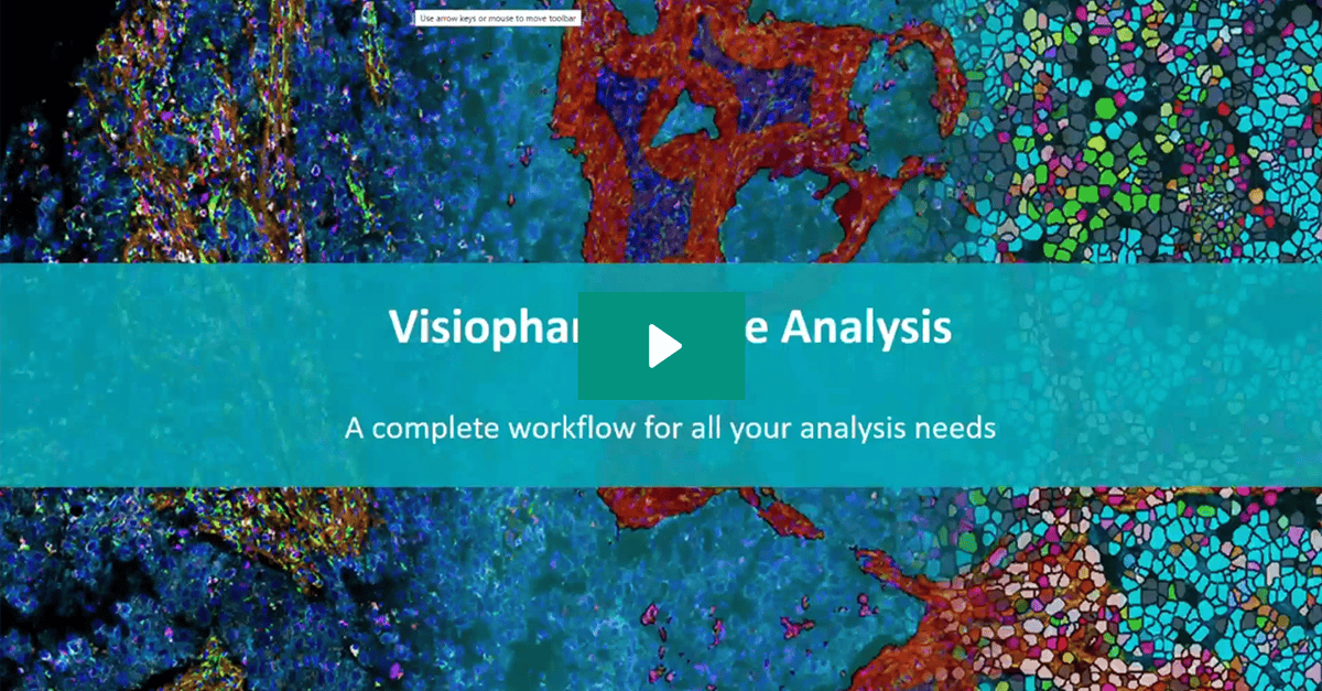
So to kind of take a step back and go into how does that workflow look, what I have here is what we call a complete workflow for all your multiplex image analysis needs.
And it says publish at the end. I would hesitate that and you’ll see in the beginning, what we do is we analyze the image. We provide data for every single object in there, and then we can visualize it, we can count it, but in the end, you probably want to do some statistical analysis on your own. You probably want to publish, you want to plot the data, visualize the data in your own format, so we want to make it available to you to put into your downstream data pipeline.
One thing to start with is you don’t have to start from scratch. We have what we call quick start ups, I call them template ups, these are the Brightfield examples.
Next slide, I’ll show you some of the fluorescence, but the idea is there are a lot of people who’ve worked in Vishwan before and we can take inspiration from that. You don’t have to create a tissue detection algorithm from scratch. Every single project that it rounds that has a whole slide image in it, probably want to do a tissue detection, so we’re not analyzing blank space, so we have some area number to quantify by. You might want to do a tumor stroma segmentation.
That is something that’s already been built in there. We can then modify it to your example.
Or you want to do some complete different tissue segmentation, you can still find something that’s been done in the past, retrain it, use that as the template for what we’re going to do. And this is how the software works. You kind of build these, we call them apps, not to be confused with what Apple calls an app, but just these algorithm blocks that can sequence together.
So we can get all of that spatial information when we start to go into the phenotypes of each cell, then we have done the tissue segmentation. We’ve done specialized cell segmentation for that instrument, for that tissue, is something that you can then pick up from here.
When we talk about detecting objects, cells, tissues, most of the time, it’s going to be based on what we call a deep learning classifier. And it’s a very intuitive thing to train. Essentially, if you can see it in the image, you can draw examples and we can train the computer to look for that. We can then set up hard rules afterwards and say, well, it has to be this certain size, this certain shape or express this biomarker.
But essentially, we just need your biological knowledge of the tissue to say this is the area that I’m looking for, whether that’s a tissue segmentation or we are looking at a on the cellular level here.
I can’t stress enough how much I think tissue segmentation matters when we’re talking spatial biology.
We do see that you have different compartments, which is interesting to know if this phenotype is in it or close to it or completely outside of it. It might also just be that you have artifacts.
You have out of focus areas, you have areas where some of the signal has just pulled up.
You can highlight that as an artifact area with the tissue segmentation and we can keep that data in the dataset for later. We can then at the end when we are looking at our results, explore and either include or exclude that data, so you’re not throwing away anything upfront, because these multiplex images, they cost a lot of money, they take a lot of time to make, So having the ability to make the decision later on that this outlier, this cluster I see in my tesne plot, well, that actually carries a tag that is from this artifact region that I’ve visually confirmed purely based on mythology, but that is something I don’t want in my analysis.
Then we kind of go into the cell detection, the nuclei detection and that to me, there’s a differentiation between what is cell detection and what is nuclei detection.
If you have a biomarker that reliably outlines the membranes of the cell, we can include that. We can build the object detection around that part. If you don’t have that, then the best guess is find the nuclei and dilate.
You can then introduce specific rules based on the biomarkers of that nuclei to say, do we want to change how we do the dilation according to other objects in the neighborhood. You might also have a membrane marker that’s only expressed in a certain area of the tissue, can then say the cell detection will run based on the membrane marker in that area and then do nuclei detection with dilation outside. So something like tumor stroma, typically you have a pancytoperatin in the tumor that can function as the membrane marker.
The example I will give you is analyzing a tissue based on the DNA DAPI channel. And if I just run the out of the box nuclei detection algorithm, I get this.
And I see two purple magenta spots here, which is my CD68 marker, that clearly hasn’t been found.
I can then go ahead and say, am I happy with this? There’s not enough DNA signal for the algorithm to pick it up.
But I might think that that’s actually an actual cell. So I can include the CD68 in my cell detection.
I can even go as far as say cells that express CD68, they have to dilate in a specific matter. So macrophages, I might say I want them to dilate along the major axis of that specific cell type. So I’m starting to create specific rules for specific objects that I know based on the biology, this should have a special rule.
Once I’m happy with this, I then start to go in and do my phenotyping. And this is where I say, we want to try to give you the control over what you’re seeing on the image and what comes out in the end. So here, I’m doing a threshold based on the mean intensity or deep learning probability that this each object is positive for a biomarker.
So I simply go through per biomarker and look at the image while I adjust these thresholds, either visually in a gate or just by pure numbers, and I can then see it directly in the image live updating with yellow dots on the cells that are positive for that biomarker according to my gates, according to what I see.
So that’s what you’re seeing here. You can do it across multiple images, but we also know that there’s variation in these images.
So something like mean intensities to threshold on that might be specific to a cluster of images, it might be specific to individual images that you say, for this specific image, I want to go in and set this threshold.
Now that sounds like something that’s going to take a while, but I want to remind you again, these images probably have taken a week to create and they’ve cost you twenty, thirty thousand euros to create.
We want to make sure we get all the data out of that.
We can’t do an unsupervised clustering. Most of this multiplex data, what we want to kind of convey today is you have the ability to go in and manually verify, explore the results that you’re putting out.
You then have tools to explore that. You can go into a co expression matrix. I can look for immune cells that shouldn’t make sense. So a CD8, CD4 cells, wouldn’t expect to see in a lot of tissues. If I see those co expressed in the co expression matrix, I can then click that, see where they show up in the image again and verify, is it my thresholds that I’ve set wrong? Is it my cell segmentation that’s wrong here? Or is this one of those areas where we have a three d object, we cut it in a two d plane and they’re just CD4 and a CD8 cell on top of each other.
I wouldn’t expect that number on a whole slide with thousands of hundred thousands of cells to be zero. Probably someone where there’s one, two, three, four, five, but I can go in and I can visually see that. So when I see that phenotype in my final plot, I know where it’s from, I know why it’s there.
You can do your cell gallery, you can start to go into your tesne plots.
So just the interactivity of this is, for example, if I want to click on my CD14 PDL1 positives, I then see that with a yellow dot in the tissue, I can zoom in, I can see those specific cells.
If I then go into the testing plots, the whole story of interactivity continues. I can start to just plot all of my data in here.
But going back to that tissue segmentation, I can start to split the graphs based on the compartments that I have. This is where for example, I could have that artifact region, I can see where that shows up in my testing plot.
I can start to color by, for example, biomarkers. So this is the biomarker intensity for CD68, my macrophage marker. I can do it on the binary positivity of my markers. So say where are my CD45, I can start to get counts of how many of those cells are then in that region. So asking not just in total, what is my number of CD45 cells to the total number of cells, but in specific regions will show up and you can start to create it as multiple positives. So this triple positive CD45, CD3, CD8 cell, that combination of markers can then be highlighted on the plots.
And again, you can visually inspect them by outlining them in the plot saying, I want to see the cell gallery or I want to see where they show up in the tissue.
All the way up to this point has just been about figuring out which phenotypes do I have, where are they, am I happy with it.
Now, we can start to get into actual spatial analysis. So asking question I asked of pandas of my specific phenotypes. So if I’m a tumor cell, how many CD3 cells are within a certain distance? You can start to do close, intermediate, long distance and break that up into categories. You can also ask if I’m a tumor cell, on average, what is the distance to the nearest CD3 cell?
And you can start to do this for multiple combinations of biomarkers. So you start to build out this matrix. So instead of just asking what’s the difference between my two slides, my two patient groups here in raw numbers, we can do that in flow cytometry. We can ask what is the difference in the distance in the relationship between cell types in a workflow here.
And again, we can also drag in our tissue regions and say, I want to exclude every cell that’s part of this artifact, for example. So the idea is to go in what we call an end to end workflow.
You have the visualization, you have the tissue mapping, you have the biomarker distribution, your cellular phenotypes, and then the spatial analysis. And from here, you then export that result. And you go and do the data mining, you do your statistical analysis the way you want to do it.
You’re not going to be alone with this. This is I hate myself for saying this, but it’s a sales pitch I do. You could drop me into a Ferrari.
If I don’t know how to drive a manual car, that’s not going to be a fast car. I’m just going to be stuck in first gear.
What we do with our software is we have a support team, we have nerds like me that know the software, you know the science, you know the biology of what you want to do, and in combination, we can get to a workflow that works for everyone.
I could have the best software in the world if I just give it to you and there are a lot of features, a lot of options, you’re not going get far. That’s why we sit here and we can guide you either standing next to you or via Teams call, sit and look in your screen, you point out what you want to do.
I want to end it here and open up the floor for questions.
This presentation demonstrates Visiopharm’s image analysis software platform designed for multiplex and multimodal image analysis in research applications. Niklas Petersen, Technical Specialist at Visiopharm, covers Visiopharm’s four software pillars, with focus on the Phenoplex pipeline for analyzing complex, data-dense images from various instruments. Key features include instrument-agnostic analysis, image co-registration capabilities, tissue segmentation, cell detection, and phenotyping with manual verification at each step.
The platform allows researchers to maintain control and confidence in their results by visually inspecting data at every stage, from initial image analysis through spatial relationship mapping. The workflow includes tissue mapping, biomarker distribution analysis, cellular phenotyping, and spatial analysis tools that can measure distances between cell types and analyze spatial relationships. The presentation emphasizes the importance of spatial context in biological analysis and concludes with information about their support services to help researchers effectively utilize the platform.

Niklas Petersen
Technical Sales Specialist, Visiopharm
Niklas Petersen holds a degree in Biomedical Engineering from the Technical University of Denmark, with a focus on quantifying spatial biology through AI-based analysis. In his role at Visiopharm, he helps customers translate complex biological questions into clear, quantifiable results.
As a specialist in digital pathology and image analysis, Niklas supports researchers and clinicians in unlocking the full potential of AI-driven workflows. He combines technical expertise with a collaborative approach, delivering intuitive demos and tailored guidance that turn complex spatial data into actionable insights.
Known for making advanced technology accessible, Niklas is dedicated to transforming tissue images into meaningful data – one cell at a time.