Transcript
Hello, everybody. Welcome to another spatial biology master class. I am here today with professor Jared Birx, and he’s gonna be talking about multiplex, multi mutiomics, and the future of spatial biology.
At the end of his talk, there will be a q and a session, so stay tuned. And welcome, Professor Jared. I’m gonna hand it over to you now. So let’s enjoy your presentation.
Thank you, Leticia. I’m happy to be here and excited to present today.
I’m gonna talk about multiplex multiomics and really how we analyze that type of data and look at that type of data, spatially.
So I like to start a lot of my presentations with this quote, and it really is specifically pressing to a lot of technologies. So you could replace the word microscope with any technology or assay.
And, really, it’s talking about our internal bias and what we get attached to in our data and what we hope to see and hope to find. And this is not a new issue because we can get tricked into seeing what we want to see. As we can see here, this quote is from Henry Baker in seventeen forty two. And for the people on this side of the Atlantic, seventeen forty two is a really old date, and some of us have a hard time placing that in history.
This predates Mozart. Most of us can place Mozart a little easier. So this is clearly not a new issue that we’re having. This is a long term and a persistent issue, and we do really need to be cognizant of how technology and assays and analysis really work to make sure what we’re seeing is truthful and, not just our own bias.
So where did all of this start? Well, this all started not quite as long ago as Henry Baker, but not very far from that. H and E staining really started in eighteen seventy five. It’s a nineteenth century technology. It’s still the current clinical standard. It’s widely used to find tumor and stroma or healthy tissue, but it’s really kinda limited for us to understand progression in the way that we do currently with molecular applications.
Immunohistochemistry really evolved in the nineteen twenties where we started looking at, colored antigen antibody complexes.
In nineteen forty one, we started looking at immunofluorescence.
Most people don’t realize that immunofluorescence came along before DAB and hematoxylin. This was really challenging because of all the same problems that we still have today. In the sixties, DAB and hematoxylin really came along to, amplify the signal. We’re still using a primary and secondary, this time with the HRP molecule to drive that DAB conversion. And this gave us some information. And in this example, we can see the CD sixty eight macrophage and the CD three t cells, and the macrophages are largely inside the tumor and the CD threes are outside the tumor. The problem is these are two colors we’re missing a lot, and we miss the spatial relationships between these two different colors because they’re separate slides or separate sections, and they could be quite far apart, which can really create some specific problems.
So how do we take that two color assay and apply it to something like the tumor immune microenvironment?
And in this cartoon, you can kind of see where we have macrophages, whether they’re a tumor associated or a regular immune macrophage.
You can see that we have blood vessels, we have t cells, we have tumor cells, and really all the other parts of the immune compartment. And if I were to ask you how is it built and how does it work, we kinda have some vague understandings. But from a two color assay, this is really hard to ask and answer because we don’t have that spatial relationship between two cells let alone three four or five cells and that’s really where I’m gonna try to get to today and explain, in some of the ways that we’re talking about the data.
So when we look at the assay, we take a tissue out of patient, we put it into to generally an FFPE block. We then section that block. We put the section on a glass slide and then we do a primary antibody of some type of secondary to generally label that primary. We then counter stain it with a nuclear counter stain. And this is really a DAB hematoxylin like approach, but this methodology is easily modified these days with several different applications to make this higher plex.
So with that higherplex, what’s our aspiration? Well, it’s who, what, when, where, why, and how. It’s the classic questions. We wanna know, what cells are present, where they are, what they’re doing, who they’re talking to, and how it all works so that we can hopefully improve the lives of patients.
So we need to know the base components and just to get everybody speaking the same language. We have phenotypic proteins.
These are really lineage markers. These help us name cells, their badges, but they’re also functional proteins.
And when we think of these, these tell us who is present, and there’s a bunch of different ways we can identify them. We have structural proteins. These tell us where where the tumor is, where the stroma is, where the blood vessels are. This tell us where those phenotypic proteins are located, and they are our landmarks. And without our landmarks, we’re kind of missing quite a bit of detail.
And then we have functional proteins, and this tells us what cells are up to. How are they communicating? How are they interacting? What’s upregulated? What’s downregulated? How is that cell really being affected by its environment? What may be considered exhausted or energized?
And so this is really the status of the cells. So we really need these three classes of markers, phenotypic, structural, and functional to identify this type of information.
So if we look at my little sphere, this was originally designed by Bruce Lowell. Bruce Lowell is an adult fan of Lego, and he designed this sphere structure and then I modified it to kind of be colorful and really represent all the different immune cells and the tumor cells and kinda how they interact.
And if we, like kids, were to take this and try to solve this as how it was built, we would need the proper tool to actually do that. There is a proper tool in this case, but most kids don’t necessarily use that proper tool. They do a different approach.
But before we get to that, if we look previously at the world of flow cytometry, they would largely dump out the parts and they would look at a compositional approach. And this is flow or mass cytometry.
This tells us what is composed in this sphere, but maybe not much more beyond that.
So to get to that, we would have to disaggregate this. And to disaggregate this, we would smash it on the floor, break it into parts, and then we would count those parts. That’s a flow experiment.
The problem with that is this is an actual representation of every part in this sphere.
And when we disaggregate and if I were to smash this on the ground behind me, what we would find is that not all the Lego pieces come apart. And if we were to disaggregate our tissue, not all the cellular pieces come apart.
And so we have to actually filter our disaggregated product before we put it into the cytometer, or we could clog that flow cytometer.
So that means we don’t have an exact representation of every cell or every LEGO part in the sphere. We only have portions.
And if I only had portions and I were to hand it to any member of the audience who could actually reassemble these portions to get the whole, especially if I said, well, you have to have all these color relationships exact, much like a more, like a Rubik’s cube. Every color relationship is really critical.
That makes reassembling substantially harder in the way that the sphere is constructed.
So we really lose, the purpose of each color, the purpose of each shape, and the purpose of each element.
And it does kind of create a bias because we don’t know what we’re selectively removing when we filter out the sample. Are we removing big cells? Are we really removing small cells? Does something stick to one or the other? And in the past, when I’ve done this in person and I’ve asked by show of hands in the audience who looks at their filter to see what cells might actually be in it, I’ve yet to find anybody raise their hand and say, oh, yeah. I’ve looked, and it’s this cell type. Most people don’t know and they don’t don’t go back to to check that and that’s really an important factor.
So we generally take this data, to the next step even though it’s partial and we do this clustered analysis of tSNE or UMAP clusters. And in this Lego example, you can see that the little Lego guy sorts out the parts based on color and organizes everything by the similarity of the color of the part. Now we could have done it by shape. We could have done it by color and shape. And in the cells, we do this generally by intensity or intensity of the phenotypic markers.
The problem is when we cut a tissue section, we don’t have a uniform piece of a cell because it’s a three to five micron thick section, and a cell on average is twenty microns. So that three to five microns might be from the middle. It might be from the edge. It might be some somewhere in the between the middle and the edge, which means we might get a variable expression that’s just due to the bias of the way we’ve cut it, and looking at an absolute intensity can mislead.
So, again, we’ve gotta be careful with what we do.
So when we come back to this disaggregated approach, what we can’t answer was the layout, the structural elements, how the sphere was actually built. We can just talk about the composition.
And in reality, that structure is really important because it talks to or speaks to how one element interacted with another to build the sphere. And in the tumor, that’s exactly what we wanna know because we wanna uncouple that critical element to stop disease from progressing and improve patient health.
So we need a construction approach.
There’s a lovely LEGO example of this as well. We just take our UMAP TISNI piles of parts, and we look at how it’s constructed, and we put them back into context.
And this is where imaging really kinda comes into play.
So when we think about image analysis, this confuses a lot of people, but breaking it down into parts or apps is really helpful. And if we think about this image as our classical image here, panel design is really the start of all of this because panel design allows us to account for the structural elements that tells us where things are, the phenotypic elements that tells us who things are, and the functional elements which tells us what those cells are up to. And so the first thing that we really wanna do is segment the tissue and find the tissue from the glass.
Once we find the tissue, we’re gonna really formally start image analysis.
And that really starts with the tissue segmentation, then we’re gonna segment the cells.
And by tissue segmentation, I really mean tumor stroma, muscle, fat, blood vessel, that sort of subsegmentation.
When we get into cell segmentation, we wanna look at the cell boundaries so that we can identify the t cells from the b cells from the macrophages.
And a lot of researchers still think that this is the treasure box that we phenotype the cells, and we can say, hey. Look. I’ve got t cells here, and they’ll count them. So they’ve done a really expensive and reasonably slower flow cytometry experiment. They’re back to just counting cells. And the point is that we don’t wanna stop with just identifying or counting our cell types. We wanna understand kind of where they are located.
And so this is where all of the output variables come into place, and that could be intensity or location or distance or shape, area form, or relationships between adjacent neighbors.
Now this creates an informatics hazard because it’s a lot of data and it’s a lot of numbers. And those informatics hazards can lead to drinking because it can drive you a bit insane, and you can kinda get lost in your data.
The point here is to not get lost in your data, but to try to find that novel finding because the novel finding is what’s hopefully gonna improve patients’ lives and help you get your next paper. But really find that relationship or relationships between those critical cells so that putative drugs or novel therapies can kind of be developed and, tested and then hopefully applied.
So when you get these large datasets, it is really important to get a lot of people that are more numerically inclined to kind of help dig through them, so that you don’t get lost and drive yourself a bit mad.
The really key step here, and I love this quote, a favorite theory of mine is that no occurrence is solar solitary, but merely a repetition of things that has happened before and perhaps often.
This is also not a really new quote. It’s Mark Twain, an American writer, and it speaks to patterns. The part that everybody kinda tends to forget when we come to tissue and cell distributions and cell engagements is evolution.
When we think about genes, genes evolved for specific functions, and we see conserved domains. We see start codons, stop codons. We see hairpin loops. We see structure. When we look at protein, we see nuclear localization signals. We see, different folding domains. We see other, like, Golgi retention signals.
These are really similar across species because they were evolutionarily derived and then evolution kept them in place as organisms evolved.
Well, our immune system is no different. It’s evolved evolutionarily to function in the way that it does, And it is really similar across eukaryotes.
And as we look at this, that means there has to be a certain T cell distribution or macrophage distribution or B cell distribution.
And that means that there’s gonna be patterns in this data, especially in the spatial data. And as we look at those patterns, those will tell us or speak to the engagement of one cell and another cell and how they communicate and what they do together.
So, really, in these numbers, we’re looking for patterns that we can then identify a fingerprint that talks to function.
So in this example, this was a very early imaging mass cytometry example. It’s a twenty plex, I believe. And what’s really interesting is when it was done, most people had not seen a twenty plex. And so I play through the different channels just to kinda reveal the data and how much information is here. And in a single one or two color assay, how much would really be lost.
And when we start to look at, subsets of this data once the twenty plex finishes playing because it’s really hard to see all twenty markers at one time, I’ve broken it into three separate panels.
And what we can see here in panel a is that we have this green cell that’s primarily out here in the stroma, but when it does get inside the tumor, it has an adjacent white cell neighbor.
And we don’t really know what this green and white cell, are doing, but we know that when we look at the cytokeratin, we can see this enhanced ribbon of cytokeratin in the tumor. And all of these green white cell interactions occur on this enhanced ribbon of cytokeratin.
This is an odd and interesting finding.
And it seems as if there’s a facilitated pathway for this green and white cell to infiltrate into the tumor. And maybe the white cell is a chaperone to the green cell.
We don’t really know.
Now when we come over to panel c, you can see that I’ve changed some of the colors because the white cells are not the same as the white cells in panel a. And when we look here in panel c, we can see that the shape of the cells, especially the shape of the stromal cells, have really two different phenotypes.
If we look up here in the top kind of quadrant of panel c, we can see a white, green, red cell interaction.
And we can see that the white and the green cells have kind of gone from an elongated fibroblast shape to a very round shape, and we can see that they’re really in close proximity to one another. And if we look more in the middle of this image, we can see another red, white, green cell interaction, and we can see pseudopodia reaching out some distance connecting the red to the white and the white to the green. So perhaps this is that fingerprint and it’s not a binary one to one cell type. In this case, it’s a three cell type engagement, but we know that these green cells have very different morphometric features than this green cell or this green cell up here.
But we also have an oddity here of a red cell with a pseudopodia touching a green cell. So maybe it’s not just red to white to green. Maybe red can connect direct to green. And these are important things to start teasing out and questioning as we look at larger portions of the data.
Observation is always critical.
So the way that I generally like to talk to people about this because they don’t know where to start with these questions is everybody had to choose where they wanted to live.
And where they chose to live had specific questions. What’s the cost of living? What’s the cost of transportation or moving around? Is there public transportation? Here in the US, not so much. In Europe, there’s lots of public transportation.
What’s the climate like?
What are the school districts like for your children?
Who are your neighbors? Are they loud and up at two AM, or are they quiet and and kinda nice? And then what’s your plan for future growth?
These all have homologues, parallels to the immune cells and the immune compartment and disease. We can ask these same questions about where the cells are, and it’s kind of important to help us put this into context that we’re more used to asking the questions so that we can come up with really ingenious and novel types of questions.
So keep that in mind when you start to look at this data because this orange, macrophage and this red macrophage have very different neighbors even though they do share a couple of neighbors, because this has more exposure to that infiltrating, T cell than this one does. And this also has a different, composition because it’s got exposure to the CTL cell. So it’s important to kinda notice these these variances in the neighborhoods.
Why is this important? Well, tumor cells really control their neighborhood, and they give rise to their own supportive cell.
And, if the video sound was playing, what we would discover is Emmett, the, from the Lego movie, who is a master builder, comes in and finds and takes Lego pieces that he really wants.
He is a cancer stem cell. And as he finds these parts that he wants, he actually constructs them in a way that is novel. And when he constructs them into this novel design, there you see there’s heavy construction equipment, he builds this weird mechanical mech, that has some things that are similar, but many things that are different. And the immune cells kinda roll in here at the end, and they say, what the heck is this?
So it changes it just enough to make it unrecognizable even though it’s built with recognizable elements, and makes it a bit confusing.
And that’s really important to remember because that’s really what disease is doing is taking our own things and just mutating them slightly.
So this is the second video that I was going to play, and it will play. And it’s basically why is everything in Atlanta an hour away from Atlanta.
And what this, Instagram person is speaking to is that there’s a relationship between roads and traffic.
And that as you make roads wider or larger, you get to a homeostasis in traffic. And the oranges that popped up was saying if you lose ten cents on every orange you sell, doesn’t matter that you sell more oranges. You’re still losing ten cents per orange. And so the more you sell, the worse it makes your, problem.
Well, as roads grow, there’s a homeostasis to the amount of traffic that is possible on those roads, and so you get a problem. And if you that has a relationship to parking. And as he just showed that big arena with all the parking, as you build out roads, you have to build out parking. And as you get to parking problems, you get to road problems because cars are really inefficient ways to transport people.
And so you get this relationship between parking and roads and complications in how you move things around and just making the road wider doesn’t solve the problem. You need to use mass transit, which is what Europe’s figured out, what the US hasn’t figured out. But in our cell systems, we don’t necessarily have mass transit. So how do we solve the problem of parking and roads?
And how do we solve the problem of getting our immune cells to our tumors in a way to have them be functional, but then we have to park them at the tumor or infiltrate them into the tumor so that they can be functional at the tumor. So we have not only this where you want to live problem that I previously described, but we also have this traffic and parking problem because we have to get to other locations, and we have to be engaged once we get there and not just circle around because there’s no place to park our car.
So, we’ve got kind of a dual problem here in the way that we look at our tissues, and we have to remember that our tissues are really snapshots in time and not, live cells, and we’re not really trafficking and and following where those cells are moving in real time. So we’re just getting that snapshot.
This also highlights another problem that we tend to forget is that for cells to move, this comes at an energetic and protein cost because we lose adhesion molecules as the cell kind of crawls across even a glass plate.
This comes at an energetic cost and a cell is not going to do something without considering that energetic cost. We have to consider the laws of physics, the laws of motion, the conservation of mass and energy, the laws of thermodynamics, and electrostatic laws. But we also have to think about once the cell moves and migrates the way that it’s going to communicate.
And these communications also come in energetic and protein loss because a lot of the times these are secreted molecules, secreted proteins.
Sometimes we build large structures to help with that protein trans transportation.
Sometimes we just, secrete these proteins, and we hope that they get to the right place. Sometimes it gets really complicated, and we build a whole extracellular vesicle.
All of this comes at an energetic cost, and the cell doesn’t throw away energy and protein and and material in a willy nilly fashion. It does it in a highly conserved approach where the cell would be inefficient and it would actually kill itself because it would run out of materials or it would run out of energy.
And so one of the things that we’ve largely been doing to this point is just looking at protein, or sometimes protein plus RNA and thinking that we’re going to see everything that’s actually happening in cells.
And that’s one of the reasons for the multiomics approach is we’re trying to put back some of these other laws of physics and consider them when we actually look at this type of data.
So how do we innovate? How do we really think about the the next step in spatial biology?
Well, we have to introduce a new method, a new idea, or a new product.
We need to understand how those new methods or new ideas function. And sometimes it’s not really that new. It’s just a twist on something that’s old and making a small change.
So I like to talk about, multimodality, multi omics, and I like to diversify the challenges, by using multiple pieces of equipment to give us better insights. If we look at a blood sample, we get a serum sample. We can look at cytokines.
From those cytokines, and from the PBMCs that get isolated, we can look at the composition of our tissue or the composition of the immune compartment that’s in the blood.
We can then look at imaging data and use that composition to see how similar or different the construction of the tissue is and the immune cells that are present in the tissue. But we can also use that cytokine analysis to target cytokine detection in the tissue.
And if we pair some of these different technologies together, we can get further faster in our understanding. And I’m gonna show you a little bit about this pipeline today, but there’s lots of pathways through that kind of graph.
One of the things that’s really important to remember is we’re using a fixed tissue.
And that fixed tissue can be cut into sections.
When we cut it into sections, we actually have the same cell in multiple sections because as I said earlier, the average cell is twenty microns in diameter.
And this means that if we cut it at four microns, we’re gonna get five sections with the same cell. And if we cut it at five microns, we’re gonna get four sections with the same cell. And it’s not gonna be perfect. It’s not gonna be every cell, but it will be a majority of the cells.
And because of this, we can subsample each section with a different modality and bring different clarity to the way that we look at the data. Now I put spatial proteomics in the midsection because spatial proteomics tends to give us the best tissue boundaries with our tissue markers for tumor and stroma and blood vessel and all of the other different tissue compartments.
But it also gives us our best cellular boundaries because we can use membrane proteins, which are largely phenotypic identifiers, to find the edge of cells.
We can then take those annotations and pass them into a targeted or a non targeted analysis.
We can still do the classic h and e to make all the pathology buddies, happy and, give a better context. And then we can even save a section for targeted, questions, whether those come from the reviewer comments or those are more targeted questions based on the early analysis.
But by cutting these five sections, and we only have the opportunity to do it when we cut the block, we can get this adjacency and look at the same cell across these, five sections or at least a majority of the same cells across the the the five sections.
So with this approach, I’ve had the the blessing of working with Sammy Ferri Borgaggio, and this is a picture that I quickly snapped in the lab as we were looking at a, positive and negative control.
And that positive negative control, she was really curious to make sure that it was gonna, work out correctly.
And and she was this kind of tied up over it and this angsty over it. And, this is the correct type of researcher you wanna work with because this means they care so much about the positive and negatives that they, are really going to make sure that they’re looking at the data correctly as well.
So in Sammy’s twenty twenty three paper, largely using Visium and, OPAL, She actually identified an interaction between APOE and LRP five. And this APOE LRP five ligand receptor, she found that in long term survival, this communication between the cancer associated fibroblast, this green cell, and the tumor cell was disrupted, and the APOE LOP five didn’t communicate. But in short term survivors, she found that this communication was intact. And interesting, APOE is a lipid metabolism marker. Now this is a non canonical use of a lipid metabolism marker, but keep that in mind as we go through some of the data. And the other thing she found was a series of additional markers to identify the cancer associated fibroblasts, the calves, that she didn’t previously know. So she was better able to define a cell population, and she was better and she was able to define a receptor ligand, communication pathway that correlated with long term and short term survival of ovarian cancer patients.
So we’ve since gotten the Lunaford Comet. The Lunaford Comet is a sequential immunofluorescence device. It automatically stains two primaries then two secondaries.
We then image those two secondaries with the DAPI counterstain.
We then elute those primaries and secondaries, and we repeat this process. And we can repeat this twenty times. And because there’s two antibodies per cycle, we can look at a forty plex. And so this is a forty plex panel that we looked at and because of her paper, you can see that we’re looking at a lot of cancer associated fibroblast markers. We’re looking at a handful of other immune markers, but then we’re looking at a plethora of functional markers because we want to know what’s actually happening in this space.
And we got images off of this that were quite lovely and we can find all the populations that we expected, But we found that this tissue was still in really good condition.
And so we took the tissue out of the comet after the four d plex, and we stained it for twenty six additional protein markers for the Hyperion Imaging Massitometer.
And when we did, we repeated a handful of markers like smooth muscle actin and some of the t cell markers, but we brought in a lot of novel functional markers, to to expand and extend the functional analysis that we’re able to do.
And we found an error, and this is really important, and this is why I like to point this out and use this as an example. This is the COMET data, and this is the IMC data. You’ll see in this area of the tissue, we have a lot more cells.
But what I didn’t realize in this early testing is that Sammy had cut these sections at ten microns thick, much thicker than our typical three to five micron section.
When the comet images, the comet is an optical system. The ablation system. The optical system has an axial resolution of two point one microns. So out of the ten microns, we only looked at this little thin two point one micron section.
So this means that when we laser ablated, we looked at a thicker section, and that’s why we got more cells in the IMC image than we did in the comma image. And when we employ this method now, we make sure that we cut them at four microns so that the two tissues are more closely in alignment for, both modalities so that we’re not looking at additional cells that we might not have seen.
But we didn’t just stop with the the extra protein.
We went a little further, and I’ll I’ll get there.
So we took this image. We did tissue segmentation. Where’s our tumor? Where’s our stroma? Where’s our interface? Interface? That interface is the reactive stromal space.
That reactive stromal space is where the cancer associated fibroblasts reside. And when I turn on the calf marker in magenta and I toggle back and forth, you’ll see that most of the calves are actually located in this magenta space and that we have good alignment in our call of reactive stroma and the location of the cast cells.
So with this, we took this further because we did RNA scope and ACD method where we labeled the eleven RNAs with metal tags. And at the same time, we imaged these, antibodies. We imaged these eleven RNAs.
And you can see here in a zoomed in portion of that tissue, these are tumor cells. We can see two red, CD eight t cells, and then we can see this magenta cancer associated fibroblast. And at the moment, I’m showing you the granzyme b that’s upregulated in this c eight cell.
And when I turn on the interferon gamma, we can see the interferon gamma, RNA that is also in this location.
So in this example, we have protein plus targeted RNA to, really look at the functional role of these calves as they interact with t cells and tumor cells.
Now this was all from the same piece of tissue from the same imaging, and Visiapharm has a tool called virtual double stain or tissue align. It depends on how long you’ve used Visiapharm.
And it was originally designed to take two different adjacent sections and align and bring them together. But with this being the same section, this tool really does work nicely.
But we have this tool.
So we can work around or pass limitations, and we can bring in other modalities with an adjacent section. I’ve already shown you my five section strategy.
So in this case, we took an adjacent section to this, section that I’ve already shown you, and we put it through a Brooker’s Timstoff Flex with Aaron Seeley who’s over at UT Austin. And Aaron is a wonderful imaging mass spec expert.
And in this analysis, we get pixel related data. She uses a, matrix to liberate the metabolites.
And what’s important to note here is that this is a twenty micron per pixel resolution, so this is not subcellular.
And each one of these peaks is a different metabolite, and this is the average of all the metabolites across the image, but each pixel gets a trace like this that’s a mass to charge value.
So when we look at the image, we can find our tumor stroma and interface, and we can use the same colors. The interface is the magenta. And when we start to look at certain metabolites, we see correlation between the interface region, the reactive stromal region, and certain metabolites that we find.
And so this really says that there are regions of the tissue where specific metabolites actually reside, And this circled us back to that APOE LRP five story, non canonical use of a lipid metabolism marker.
So when we started to look at this data across the comet to Hyperion to RNAscope with the Brooker Temstoff Flex, and we aligned all of the images in, virtual double stain or tissue align, we found sixty six protein targets, fifty eight of them unique. We found eleven mRNA targets, two of which were also detected at the protein level. And then we found sixty eight unique metabolites that were found in the reactive stroma that tended to correlate with those cancer associated fibroblasts.
So in my mind, I start trying to figure out ways to understand this. So to me, this seems like the calves that are outside the tumor are encouraging the tumor to spread outside, and maybe APOE is that critical protein marker that is needed for those cancer cells to metabolize the sixty eight unique metabolites, grow and spread and become more aggressive.
And this would make sense with the short term survivors that Sammy saw on her two twenty twenty three paper. And when this is disrupted, the cancer cells are not getting the APOE, thus they’re not able to spread and metabolize these sixty eight unique metabolites.
And they, these these patients become short or long term survivors because their cancer is not as aggressive and not fed these novel sugars So this launched us into a whole series of questions, and how we actually kind of tease them out But what we really did was show you a slide to comment, IMC, to RNAscope, to Visiopharm unionizing with the mass spec imaging data to bring the metabolomics to the proteomics and transcriptomics that we were actually looking at Now, this is a tool. This is a small data set. How do we really apply it? And what else can we do?
Well, we also know that micro RNAs come into play and we have a novel way of Analyzing a micro RNA and Basant Kamal a master student is looking at micro RNAs as small as twenty two nucleotides in length. We use a probe with a DIG attachment. We use an anti DIG antibody and HRP. This is like OPAL.
And we bring in an OPAL five seventy or a TSA five seventy labeled marker, and this allows us to see these micro RNAs.
Javier and my group kinda helped her analyze some of this data. And so when we look at DAPI, Keratin, and CD thirty one, we can find our blood vessels. We can find CD forty five, our immune cells, PDL one expression, preenzyme b expression, and then we can actually find, macrophages and arginase expression.
And we can also find these microRNAs in where they’re in location to immune cells, but we can also phenotype these and identify these microRNAs in different phenotypic cells.
So we can take the same tissues and twist them really quickly after, putting them through the comet and find not only mRNAs, but microRNAs as well.
We’ve also now directly added RNAscope to the comet instead of just putting it in the Hyperion.
And what we can see here is a similar sample with keratin CD four in this case, CD eight.
And I’m just playing through a series of images, CD sixty eight with the macrophages, CD one sixty three.
But we can also look at VEGF by RNA.
We can look at interferon gamma and PD L one by RNA. We can look at APOE and smooth muscle actin by protein, but the APOE by RNA. And we’d see all of this APOE in the tumor, which means this is an aggressive, short term survivor.
And then we can start to understand kind of how it’s transmitted, because APOE can get secreted so fast that we can’t see it as easily at the protein level sometimes, but we can detect it at the RNA level, which is how it was originally found in Visium.
So by pairing this, we can resolve something that’s really dynamic and fast.
So, ultimately, this gives us a pathway of tools and, technical networks to answer and ask a lot of questions, not just a couple of questions. And this is all on one section.
And then we use the VisioForm tool to kind of bring it all together. So why did we build all these tools? Why did we figure out how to connect all these devices?
Well, this gets back to our tissue segmentation approach. And as we start to look at other novel applications, we can use spatial metabolomics.
We can use stomachs, which is a novel spatial transcriptomics method. We can use targeted transcriptomics methods like MERSCOPE, XENIUM, COSMICS, or RNAscope.
And we can really bring this together in a unique way to do more with less and to do more faster.
And in a recent publication with Sammy and a few other people, in support of a Human Tumor Atlas Network grant, we looked at, seventeen secondtions where we used three different modalities, mass spec imaging, COMET sequential immunofluorescence imaging, and stomach spatial transcriptomics sequencing.
And we looked at not only the metabolites, but the glycans and the peptides.
We used a targeted, proteomics in the middle, and then we did transcriptomics. But uniquely, stomix can look at other things as well, including microbiome data.
And so we brought these three different, technologies together to look at, six different analytes, and then we repeated this three times across the seventeen sections so that we could look at three-dimensional analysis and rebuild the three-dimensional stack.
So this gets to be a lot fast, but it’s really based on the way that we section. And, of course, we have different resolutions, the comet being the highest resolution, thus it’s in the middle. The mass spec imaging on one side, the stomax imaging on the other so that we can use the comet imaging to improve the other. And between, mass spec imaging and another mass spec imaging or any section and another section is twenty microns. So we’re generally in the next layer of cells when we look at the way that we structured the sectioning so that we’re not oversampling our data.
So if we look at the proteomics, again, we looked at the COMET. We only did a twenty plex in this case. This was largely phenotypic in focus.
We took and put this into Visiopharm. We identified tumor interface or reactive stroma areas and stroma.
We did our tissue segmentation.
And if we dive into this, we can see the magenta region versus the stromal or the tumor region, and we can see what this looks like, with a few of the stains.
We can dive into this data a little further and look at different submarkers and see what’s happening in the tumor, the interface, and the stroma.
And uniquely, what we found is a CD sixty six b population, which isn’t really visible when we look at the individual sections.
But when we look at the three-dimensional reconstruction, we can see that this population of cells is clustering. It just happens to be clustering in z and not in an x and y plane. And so we did find populations that only kind of, clustered together when we looked at the z dimension. And so when we see these sections here in the stroma, we can see these novel populations. And so that’s one of the reasons that this three-dimensional analysis is really important.
Now when we look at the metabolomics, glycomics, and peptidomics, this is a bit of a different technology than probably most of the audience is used to. We take a tissue sample. We put a matrix coating that’s gonna liberate metabolites.
We are then going to take those liberated metabolites. We’re going to detect them in the instrument. Then we’re going to wash and remove that matrix. We’re gonna add another matrix. This secondary matrix will only liberate glycans.
We can then detect the glycans and find the, glycomics.
We can then remove that matrix and add trypsin to liberate peptide fragments. We can then detect the peptide fragments. And at the end, we stain the slide and what’s left with an h and e.
But this is all the same section through these different modalities or different, methodologies that Erin Seeley really worked out. And from a fresh frozen, she’s shown that she can do nine different methods sequentially. This is an FFPE.
So largely, we do just these three, but there are ways to kind of bring this together and look at metabolites, glycans, and peptides all in the same section.
So when we look at this and we apply our tissue segmentation information from our proteomics data, we can still find our tumor stroma and interface. And in this dataset, we found a hundred and sixty four unique glycans, nine hundred and forty eight metabolites, and five eighty six peptides.
And when we dive into some of the glycans, I believe, you can see that we have novel glycans in specific stromal regions or tumor regions. And you can see that they can be void in the reactive stromal region or substantially lower in the reactive stromal region. So that means that they do sequester, which is interesting because some of these are soluble.
And, you have to realize that the resolution here is twenty microns, but we’re still getting good correlation with a higher resolving technology.
So when we dive into the transcriptomics, at this time, this is really early access to stomachs, and we had to bend the analysis. We can now do, cellular identification in the FFPE samples, so we would do this without the bending analysis.
But in this particular option, for those unfamiliar with stomachs, it is a point two two micron or a two hundred and twenty nanometer, spot that reoccurs every five hundred microns.
This is like Visium, but substantially smaller because you get four hundred to eight hundred of these spots per cell instead of cells per spot. So it is substantially higher resolving than what we get from some of the other modalities.
It also uses a poly n, and this poly n allows it to capture any RNA in the sample. You place the tissue on top of the slide, so you have to have this at the time of cutting, which creates a bit of a logistics headache, but it’s something that we have managed and clearly done because we published.
It then uses a rolling ball amplification to amplify, and then it goes into a complete genomic sequencer called a t seven, which, is a non targeted sequencing method to identify the RNAs that we found.
We can look at all genes, and we can see really nice correlation with tumor and stroma.
And we can do a Leiden clustering analysis, to identify the different regions of the the tissue based on similarity of gene expression.
Now coming back to this poly n, this allows for mRNA detection, but also microRNA detection, long non coding RNA detection.
And because it’s not species specific, we can even see the microbial RNA, so we get microbiome analysis as well from this same slide. And so this makes logistics more challenging to make sure that you’re not contaminating it with bacteria from the person processing the sample.
So when we dive into the Leiden clustering, you can see that we have layer one, layer two, and layer three and that they largely correlate, but we do have some layers peeking out of specific regions. We can see the different Leiden. There’s fourteen different regions and we can see where they cluster. We can then put those clusters back spatially and we did find a lot of novel markers. And if we dive into this further, we can see that we have canonical tumor and stromal markers, but we also found some novel markers for tumor and stroma that seem to work better than our canonical tumor and stromal markers.
We also found in specific clusters long noncoding RNAs that correlated with the dark blue tumor region. We also found RNAs that we didn’t know were there that correlated with the reactive stroma or cancer associated fibroblast region.
These weren’t found in Visium, but are found in this method, which we think might be more sensitive, because of the way that it works. Regardless, we found novel transcriptomic markers for regions of the tissue that we know are really relevant.
We also got the microbiome data, and we didn’t, in this particular publication, dive too deeply into it. We just showed the distributions, but we did get spatial analysis of the microbiome data. And as we understand how to control the sample processing to make sure that we’re not contaminating or that we’re minimizing contamination, we’re gonna dive deeper into this data as well.
So what we did in this analysis with this Leiden voxel is we, looked at these Leiden voxels and quantified the stomachs data, the transcript data from the different regions, and you can see the green and the, magenta upregulation and where that correlates with SMAD four and CADPS.
But we can also, in this same space, look at glycans in this example that are correlating in the blue and the green area.
And we can also look at the sequential immunofluorescence at specific protein markers that are correlating in the tan region, or in the the green region that we would expect in the tumor and stroma like keratin and smooth muscle actin that would be in the correct locations as well So this gave us a way to kind of analyze and merge all of these different analytes whether they are transcripts or metabolites or glycans or proteins or whatever and then consider them even though the variation in resolution exists.
And largely, we put all of this together inside Visiopharm and did a lot of the base analysis there.
We just extended it further after.
So what this really allows us to do is merge these different data to get a more complete picture because as we get the more complete picture of which cells are more energetically favored because they have the right metabolites or which regions might have more resources, this might explain why tumor cells are driven in a certain direction or why immune cells are inhibited from entering in a certain location.
Because one of the comments that I commonly hear is my t cells aren’t infiltrating my tumor. And one of the questions that I ask is maybe your t cell shouldn’t infiltrate your tumor because there’s no metabolites there for them to use to fight the tumor.
Or maybe that environment is so hostile that the t cell doesn’t have something else that it needs to be re reactive there, and it’s out here on the boundary trying to work its way from the outside in and defeat the cells that are out here on the perimeter.
We don’t always understand the cues from two colors or one analyte. We need multiple analytes to really understand it.
So if we go back to this earlier cartoon and we start looking at this macrophage and trying to understand how it’s different and how its signals are different and how it’s getting different cues, it’s clearly closer to this Treg. It’s closer to the CTL.
These could be influencing and secreting molecules that it could be in in engaging with and understanding. So there could be a lot of ways that that is different from this, but it’s already in the tumor. What about this one that’s out here on the periphery of the tumor, and how is it different, and how is it getting there, and what signals are it receiving? This goes back to the trafficking and parking problem that we mentioned earlier, and I’ve only ever really seen one example where we solve this. And, unfortunately, this was an anomaly that we don’t fully understand.
But in this, head and neck cancer patient that came in and was diagnosed, during the height of COVID.
We took biopsies and we imaged them and we can see that in their tumor region. They have very few c d forty fives. They have very pretty much no t cells and they have very few macrophages They have more c d two zero six macrophages than they have c d sixty eight macrophages Well, they went home. They started to prepare for clinical intervention And in that time frame, they went and got their COVID vaccine. And the first dose went out went off without a hitch, but the second dose, they had a grade three systemic, adverse response. They were violently ill for twenty four to forty eight hours, and they were probably hating life and cursing the vaccine.
But when they came back in, what we noted was that their tumor had started to shrink. And so instead of starting clinical intervention, we postponed clinical intervention, and we started observing this patient. We started getting needle biopsies again. And from this imaging mass spec data or imaging mass cytometry data, we started looking at how the CD forty five population, the CD eight population, and the CD sixty eight, generally m one macrophages, changed in the way that they were penetrating the tumor.
So, basically, the way that we summed up this publication was that the COVID vaccine stimulated such an immense immune response that not only did it traffic immune cells to the right location, but it parked them in the right location as kind of an adjuvant therapy. And then these immune cells completely spontaneously regress this tumor until it completely went away. So this person without clinical intervention cured their tumor based on getting their COVID vaccination and having such an immune response to the COVID vaccination that they traffic the immune cells to the right location and they park them in the right location to solve the problem. So somehow they expanded the road in a way that was targeted to immune cells. And then once they got the immune cells to the location, they infiltrated into the tumor to interact and engage.
But in this study, we only had protein, so we don’t really know the full details of how these cells or what these cells were signaling once they did infiltrate.
So there’s lots of curiosity, and this is kind of the goal of trying to fill in those missing gaps by looking at things like metabolites, by looking at things like transcripts or microRNAs that might get secreted so quickly that we can’t see them at the protein level, so we use another level to kind of observe them.
So this multiplex, multiomics approach gives us greater clarity.
It gives us a more complete picture, and it lets us say more of the how that we’re missing with the who, where, and when because we have the snapshot in time. And it just fills in some of those gaps, but the image analysis is where it all kind of comes into play and we have to remember to kind of dream and try to think outside of the the technological boxes or the siloed Realms that we put ourselves in and go back and play with some kids toys because sometimes this will help us understand our bias in a novel way and Once we understand the bias we can move past or around it and really get to better Questions and answers that that we might be able to find to help patients So with that, I I’d like to acknowledge Sammy and Vasant and Aaron as well as everybody that works in the core facility here with me and all of the funding that, we all kind of have and happily answer any and all questions that might have come about.
Thanks, Jared. Woah. This was a really, really amazing presentation.
I love the LEGO pieces, especially for newbies like me. It really helps me understand complex science, and I’m sure a lot of people here enjoy it as well. And I can see we have quite a lot of questions, and we might be running a little bit over time. But for everybody who has to leave, we are gonna record this so you can watch later as well. But, yeah, let’s get get started with the first one from Vineeth. Hi.
So how do by the way, Jared, can you read the questions just in case Yep.
Yep. I can ma’am. Yeah. I can do it.
I can read them out loud, but just in case you want Sure. Yeah. I understand as well. So, do you do any preprocessing of the IMC prior to analysis?
MCD files or Omidif based?
So almost all imaging has some type of preprocessing. And if you’ve been in imaging long enough, we had dark current noise, shot noise, camera problems in older, systems.
All of this requires some type of preprocessing. IMC has a resolution of one micron per pixel, and it’s using a different type of detector. So doing some type of median filter to help eliminate some of the noise from the data is really important for IMC specifically.
But as I said, we use those for a lot of things. Median filters help us find edges of objects really nicely as well.
So preprocessing is your friend and super important.
Cool. He’s also asking, how are you linking all the data and cell IDs?
Where are you integrating it and analyzing the steps from Visiopharm onwards?
So in Visiopharm, when we do, image alignment or tissue alignment, we will we will align the images and then analyze the data from there. And so the centroid will be the same for the different layers as we go up and down, and we can pass the annotations up and down as well. This allows us to kind of visually inspect our alignment and visually inspect that the cells are aligning appropriately so that we can have greater confidence. And this is one of those sanity checks that we kind of do when we go through the analysis. And I really do encourage you to go back and look at your images often and a lot to make sure that your sanity checks are there.
And then once you do that, you can dive into the data table and make sure that you don’t have correlation of markers that shouldn’t necessarily correlate, and that might target you back to regions of the tissue that you missed.
So we kinda do it twofold. We just look at the images, but then we also look at the data and use that information to go back and look at targeted regions of the images.
Great. So Jim Mansfield is asking, how are you phenotyping cells based on RNA? By counting spots or by intensity or both?
This is a lovely argument that that I have with a lot of researchers. And the problem and I’m gonna use my cell phone as an example. If this is a cell and I only cut this little section out of the middle, I’m gonna get a certain number of RNA spots. But if I cut this section up here at the top, I’m gonna get a very different number of spots because the nucleus is here, and the edge of cell is going to have fewer ribosomes and other things that engage with RNA.
And so the spot counting is gonna be different. So I tend to like an h score or a BINDS analysis for RNA based approaches where we look at ranges. Because when we sample our our cells, we’re creating a bias. And the only way to compensate for that bias is to use a range as opposed to an absolute count.
And so by binning the analysis in, like, high, medium, low negative, I think we get a more accurate, approximation of RNA. And we can use RNA in phenotyping to help confirm what we’re finding at the protein level.
But even though we use these as phenotypic markers and name badges, my name badge is also a key that opens doors. These proteins are functional markers that also do things, not just name a cell. And so into the right conditions, I think that cell will turn on that protein marker if it needs it. So sometimes we might have some novel, engagement there, that can occur.
Cool.
And, Vineet, again, it makes sense with RNAscope, but how about the Xenium data? Can you integrate it with Visiopharm Visiopharm with Comet?
So you can integrate Zinnium data with Comet data. You would use an adjacent section.
There are some groups that are doing things post Zinnium, on the Comet or on the IMC.
Caleb, at in Oklahoma, Martin, I think it’s Caleb’s last name, has a zenium to IMC method on the same section, and he even uses, an H and E stain on that slide after the xenium and then stains it that’s, h and e labeled with IMC antibodies and images that and has been successful in using IMC based imaging because it’s not a fluorescence technology.
And H and E is wildly autofluorescent, especially the eosin.
So there are novel ways to bring in other methods post xenium, and I’m sure there’s gonna be a lot of papers that are out here shortly speaking to some of those.
Cool.
Reagan has a philosophical question. So technology now allows for a hundred plaques, the IF, or five hundred plus protein barcodes, ten thousand transcripts, metabolites, glycans, peptides, etcetera.
Question. Just because you can collect all this data, should you assuming reagent’s costs are not a limit even if not needed to support the working hypothesis given tissue is precious and the data is digitally archived for future use?
So Regan is always great at these philosophical questions, and it really boils down to what we know and what we don’t know and what the questions are of the experiment.
No. We shouldn’t do all every time.
And we can employ in our discovery phase tissue microarrays.
Again, speaking to evolution and the repetitive pattern, we don’t need to image all of the tissue. And I have previously published looking at a central core, a peripheral core, and the whole tissue that if we look at neighborhoods, the central core plus the peripheral core, we get the same information as looking at the whole tissue. So if we create tissue microarrays, we can do this with much fewer slides, much more economically, feasible, and much quicker. And we can also standardize, unionize the data because we’re putting all of the reagents on one slide instead of a hundred slides, which means we get less less batch effect and less less batch bias, which can really be important to consider as well. So, again, circling back to that earlier statement about microscopes and bias, we really need to consider what questions we’re asking and how we’re asking them to make sure that we’re looking at the data appropriately.
But there’s always gonna be a discovery phase, and then there’s always going to be kind of a more critical clinical phase where we’re asking targeting questions about, is this drug the right one for this patient? And, no, we don’t need all of that for answering that question sometimes.
Yes. And Vineet, asking on a broader level, what software tools are you using to integrate and visualize the proteomics and transcriptomics data? Open source?
We use a lot of the programs from the different suppliers. So Stomix has its own pipeline, and I showed you Stomix method earlier.
We’ve used Space Ranger for Visium data.
Once we get the image data, we try to align it so that we can improve the cell segmentation information.
It’s really important to use the spatial proteomics, which gives us the best annotations and can improve the the data call because a lot of the transcriptomic methods just find the nucleus and then expand out from the nucleus and call that a cell. The problem is the nuclear morphology and the cell morphology are not always the same, especially for a fibroblast, which is a long skinny cell.
So using the the proteomic signatures will dramatically improve your informatics approach, and you can use QPath. You some people have used CellProfiler.
There are open source methods. Generally, this means that you’re kind of piecing together a bunch of open source methods to try to get done what you need to get done. For a long time, Bern Bodmiller was using Elastic and then CellProfiler just to do his tissue segmentation and his cell segmentation.
It worked. It got published in really high tier, publications, but there are other ways to do some of this stuff.
Mhmm.
Matt is asking, this method seem to be a great way to better understand cells that require cell cell contact, something that was hard to analyze with flow cytometry.
Do you think this method will add new ways to understand cells that work at distance, maybe visualizing cytokine gradient in tissues?
This is a great question. And one that’s really kind of been on the forefront of my mind is we think of cytokines as messages in a bottle. We might go to the coast of France, put a message in a bottle, toss it out, and see if it winds up in Great Britain or if it winds up across the Atlantic and or in the Caribbean and hits one of the islands. We don’t really know where it’s gonna go, but with weather weather patterns and tidal flux, we can actually predict or at least, give an idea of where to go look for it.
And if we do enough testing, we can kind of track that down. We can use that same types of math to use cytokines since, the RNA upregulation and any protein that we actually find outside the cell to look at diffusion gradients from cells that have high levels of transcripts and then look at the protein that’s out and around those high levels of transcripts to try to look at those diffusions and try to figure out what were the the tidal patterns, what were the environmental conditions to look at where those cytokines might have gone when they did get thrown out of the cell. We’re really starting this work.
It’s still really early in the process, and I don’t have a here it is. This is the perfect answer, but I think this is the way we’re gonna solve it.
True. Thank you. And question from Sonia. With so many markers, many of which are in flux, how do you narrow down what is an interesting change versus what is background? Is it purely p values?
This is a great question, because we don’t always know. So we really try to look at large patient cohorts where we can stratify responders, non responders. We can stratify long term survivors, short term survivors.
We can try to tie this back to clinical outcomes as much as possible or clinical variances. And, if we can get any type of time course collection, those are really the most advantageous to try to understand what’s actually happening to this patient over time.
So one of the things that I’m currently working on is setting up organoid models so that we can do and control those perturbations and those time points in ways to try to tease this out. Because when we only get one snapshot from a needle biopsy or a debulking surgery, it can be really hard to look at this flux because we are just looking at this one moment in time.
So It’s something that we’re gonna have to dive deeper into.
Cool. Thank you.
Amazing body of work, Jared. That was tempting to wrong.
And Matthew asking, we have so many ways to look at this protein, RNA, glycomics, etcetera, what is what is the subcellular method you want to be able to use in this aspect that is not yet possible?
Lipids. That’s an easy one. The problem is in an FFPE sample, lipids are destroyed and removed, and lipids are wildly important as, a source of energy, but also a source of structure.
And when we do an FFPE embedding, we strip all the lipids away. So we’re still ignoring a major component of our tissues and our cells, because this speaks to membrane flexibility and how cell to cell engagement really occurs, how virus, virus particles infect, and a whole slew of other things. So at some point, we’re gonna have to go into lipids probably with a fresh frozen or a fresh fixed sample.
And this means a lot of the ways that we’re currently detecting with the proteins and antibodies, we’re gonna have to find novel antibody targets because our antibodies are designed for FFPE function.
So lipidomics is, I think, gonna be the next biggest thing to tackle.
Cool. And I think that was the next question from Reagan. What omics is next? Is it that’s lipids. Okay.
Lipids.
Lipids in microbiome, we’re we’re really just at the surface of the bacterial genome and or the the bacterial presence. And when we think about bacteria, they’re metabolizing metabolites and giving different off products. And so they’re really helping us break down sugars that our cells can’t break down and giving us a byproduct that our cells can break down. And understanding the way that the microbiome is kind of engaged and involved with our cells is gonna be really important because we already have publications that show patients do better with certain bacteria, versus others.
And they do use that as a clinical, treatment method at the moment too.
Cool.
Well, thanks Jared. This was a real master class.
I think if we don’t have any questions, I guess we can finish here. And thank you everyone for joining us today. And if you wanna rewatch tomorrow or another day or share with your colleagues, we are gonna share the link of this class via email and in in our social media channels as well.
And I look forward to seeing everyone in our next class in July.
Thanks again, Jared. Have a good day. And, yeah, bye everyone.
Thanks, guys.
The future of spatial biology promises to reveal the intricate functional interplay between cells, a crucial aspect for understanding disease progression and therapeutic targeting. To decode these cellular conversations, a multiplex multi-omics approach is essential, enabling comprehensive identification and comprehension of diverse analytes. Presently, our capability is limited to combining a few analyte classes on a single slide, such as proteins and mRNA, often at the expense of one class. We can be creative in our assays to go beyond, which reveals the challenge in integrating informatics to not only unify these diverse data types but also to cross-validate and interpret the interactions and their effects on multiple cells in real-time. As cells continually move and interact with different or novel groups, understanding how one cell influences another, and how this influence propagates, is critical. Advancing these techniques will be pivotal in elucidating the dynamic cellular dialogues that underpin disease mechanisms and therapeutic responses.
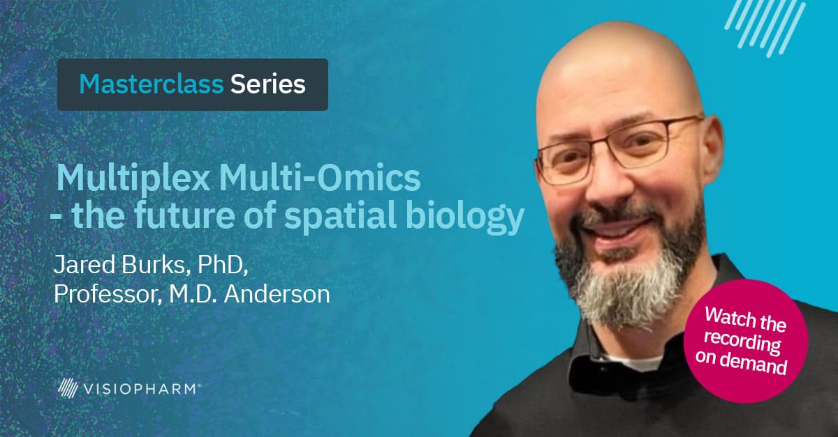
Jared Burks, PhD Professor, M.D. Anderson
Jared started his carrier at Texas A&M University learning about patterns in genes and proteins, allowing and facilitating subcellular protein trafficking. As he has progressed to MD Anderson Cancer Center, he has scaled to cellular trafficking attempting to understand the spatial distribution of cells in organ systems during disease. As in many parts of life, form equals functions. How our cells organize speaks to how they function and respond to their local environment. Bringing together multi-omics approaches allows for greater clarity in these imaging snapshots that are collected.