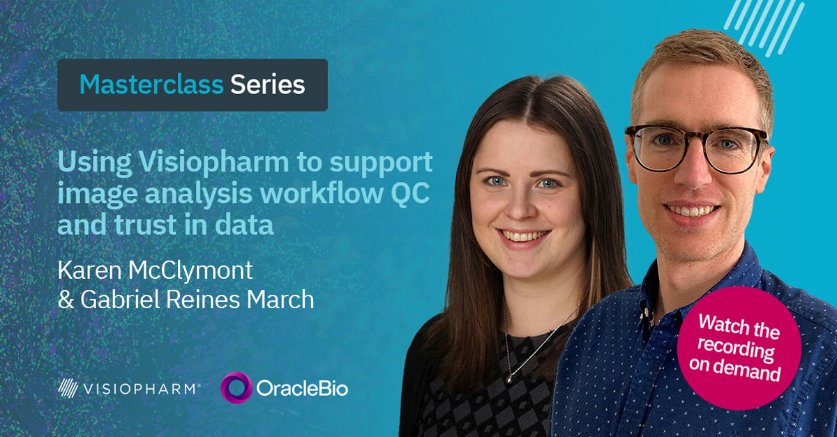
Using Visiopharm to support image analysis workflow QC and trust in data
Transcript
Hello, everybody. Welcome to this spatial bio biology master class. Today, we are having this master class with the Oracle Bio team, And let me present them quickly. So we have Karen McCliman. She’s an image analysis project manager.
And we also have Gabrielle Haines March, who is an r and d project manager. They will be both presenting two case studies on how they are using Visiopharm software to support their image analysis workflows and trust their data.
The session will take around half an hour, and at the end, there will be an a q and a session. So you are all invited to write down your questions in the chat, and we will take them at the end and and discuss. So I hope you enjoy this session, and let’s finally get started.
Thank you for the introductions.
I’m going to start by giving a brief overview of OracleBIO, who we are, and what we do before we move on to discuss a couple of case studies where we’ll go into more detail on how we use Visiopharm to support our image analysis work flows. Oracle Bio is a contract research organization specializing in digital pathology, and we undertake a range of image analysis studies to ultimately generate relevant and accurate data.
We use client specific images to develop our algorithms, which are tailored to the individual project needs with a view to quantifying, sustaining, and producing high quality data readouts.
We have an ever growing team of expert image analysts supplying industry leading image analysis services to pharma and biotech worldwide.
We cover all aspects of the r and d pipeline starting with target identification and early discovery through to preclinical animal model outputs, exploration of translational biomarkers, and then finally covering image analysis for live clinical studies.
We use a purpose built AWS cloud infrastructure that allows users to spin up multiple CPUs or GPUs simultaneously.
And the subscription model we have with Visioform allows us to maximize the productivity of our IA team to generate data quickly and efficiently.
We’re charged per image imported into the software, meaning in combination with our cloud computing based deployment, we can have members of our IA team launching multiple instances of VisioForm.
So in theory, we can have a single user training an algorithm on one instance, running analysis on a second, and using a third instance to create training annotations.
This enhances the rate at which we can complete Visiopharm based projects as we are not limited by individual licenses, and we can massively scale the work we do in terms of image QC and algorithm development to fit the unique needs of client projects.
The case studies we’ll talk about next have thoroughly benefited from this subscription model due to the massively parallel processing powers we can achieve with the IT infrastructure that’s in place for high throughput, analysis.
And I’ll now hand you over to Oracle Bio’s r and d project manager, Gabriel, who will talk you through our first case study on a pathologist validated image analysis workflow.
Thanks, Karen. So I’m gonna present this first case study, which showcases our involvement in this multidisciplinary triple helix InSight project and how we establish a robust image analysis workflow to analyze a large number of colorectal polyp samples.
So I’ll start by giving a bit of background about the InSight project. InSight stands for integrated technologies for improved polyp surveillance, which is a Glasgow University led collaboration with the UK’s National Health Service and an array of commercial partners, including Oracle Bio.
The main goal of this project is to improve polyp surveillance in the NHS so that patients with higher risk of developing recurrent polyps further down the line can be identified, screened, and treated before these polyps become malignant.
This new risk score will be developed using a multiomics approach, including data not only from digital pathology, which is what I’m gonna present today, but also genomics, transcriptomics, and also the patient’s clinical history.
Oracle Bio has been a member of the Insights consortium for the last four years, and we are the work package leads for the digital pathology effort.
For the purpose of delivering this data, we developed a series of deep learning algorithms to generate quantitative data from over two thousand two hundred CHI sixty seven stained whole slide images. And throughout the whole process, in order to ensure that the data we generate is accurate and truly represents the underlying biology of the sample, Our internal pathologists help us throughout the deep learning app life cycle from generating training annotations all the way to assessing app performance, creating ground truth annotations, and so forth.
So in in terms of the digital pathology work package, the two main deliverables, that we were assigned were, firstly, the generation of summary data, and that’s per image, including area readouts for the main regions of interest and positive and negative chi sixty seven counts split by ROI. And also the generation of cell object data, again, that’s on on a pretty much basis, including the special location of each cell, that is the x y coordinates, but also it’s the same phenotype and a variety of morphological readouts such as circularity, convexity, cell area, and so on.
Also, due to the huge number of images in this project dataset, establishing an automated, scalable, and high throughput image analysis pipeline was a must. So parameters like processing speeds, robustness, and by robustness, I mean, the ability to handle unexpected inputs to our pipeline, and I’ll give you a couple examples in a few slides.
So I was saying speed, robustness, these are parameters that are key for building a scalable analysis workflow.
So with this in mind, the proposed workflow follows a top down approach and has four main components.
The first one, which is a very low magnification tissue find and QC step to identify the tissue of interest and also remove any images with generalized tissues.
Next, still a low magnification, a deep learning classifier to separate areas of adenoma and healthy tissue.
After that, we have a medium magnification around ten x, another AI app to segment that athelial glance from the surrounding stroma.
And finally, a cell detection app based on the Visiopharm Brightfield nuclear segmentation deep learning app tailored to the project images, to improve its performance.
So on the next slides, I’m gonna walk you through each step of the workflow, showing you some examples of the output generated and also the pathologist validation processes used throughout.
So as I said, the first step of the workflow is the tissue detection and QC.
So for tissue detection, we use a very simple thresholding app to detect the tissue of interest.
And then a second app, which is deep learning based to segment and remove the polyp stock, which has very little pathological interest.
This deep learning app was built to also detect certain quality issues with the images, and I’ll show you a few examples in the next slide. But here on the right hand side, we have the polyp tissue in green and then the stock in orange, which is removed and not used for any subsequent analysis.
So in terms of quality control, in a small scale study with a few dozen images, checking every single image for large obvious artifacts is something doable, but not here. When you are faced with thousands of samples, this initial screening needs to be robust and needs to pick up major artifacts that will impact any analysis further down the line. So for example, on the left here, we had some samples that had no hematoxylate stain probably due to an issue with the auto stainer, which means our cell detection app further down the line would have not performed at should’ve. So images like this with bad stain distribution are picked up and removed in this step.
On the right hand side, I’m showing an example of slide where the scanner lamp failed, which means a number of tiles were completely missed.
However, in this particular case, over ninety percent of the tissues are still present and in good condition, but our app flagged this sample for manual review. Also, issues with non uniform background illumination, for example, both within the sample and across different slides were also tackled so that only the tissue of interest was segmented and passed on to the next step of the workflow.
So then the next step was the adenoma classifier, which was a deep learning app trained on a number of examples covering the main polypathologies in the patient cohort.
It was trained to recognize adenoma and nonadrenoma, but also background and artifacts such as out of focus, tissue faults, and stain deposits.
Here on the right hand side, you can see an example of the classifier overlay. But in orange, we have the adenoma. In green, the non adenoma or healthy tissue. Then we have a bit of red, which are the artifacts. And I see there is a bit of tissue folds and some stain deposits as well towards the edge of the sample, and also glass is detected. And as I mentioned, the stalk is the the green hatched area here, which is removed and not used for any subsequent analysis.
So here, I’m showing a few examples of the pathology slide validation we performed throughout the course of the study.
So in this particular case, for the adenoma classifier, we selected ten images at random. And on each of them, we drew two fields of view of approximately two millimeters squared.
Then we asked one of our pathologists who was blinded to the classifier training and performance to annotate for adenoma and adenoma within the ROI boxes.
Then we run the classifier within the same areas and calculated the overlap between the pathologist ground truth and the classifier overlay for each class, both adenoma and adenoma. And then based on these readouts, we were able to calculate the dice score for each class and for each image. So then once we got the readouts, we averaged them all. So we achieved on average a dice score of point eighty eight for the adenoma class and point ninety one for the non adenoma class, which is well within our quality standards.
The next step of the workflow is the epithelium classifier, and the purpose of this step is to separate the epithelial glands and the surrounding stroma. But we before we run the app, we apply some preprocessing steps to the ROIs generated by the adenoma classifier so that we could subdivide the adenoma region into luminal adenoma and basal adenoma. Luminal adenoma, which is shown in blue here on the left hand on the right hand side, sorry, is the region of adenoma that projects into the lumen of the bowel. And there were certain interest in separating the adenoma class into these two subregions. So then separate readouts could be generated for the luminal and the basal.
The basal is shown in orange, and then we have the green, which is the non adenoma. So we generated these bands, which is one millimeter from the edge.
And then from there, we run the epithelial classifier on all three regions separately. So we could get epithelium and stroma for each of the adenoma classes. That is the luminal adenoma, the basal adenoma, and the non adenoma.
So here in this busy picture on the right hand side, you can see the epithelium glands in the luminal adenoma, which is the pale green, the basal adenoma in gold, and then in the non adenoma in in the darker green color. Same for the stroma in purple, light blue, and brown. And then similarly, we, as with the previous classifier, any areas of background or artifact that are picked up at this resolution are added to the overall background and artifact classes, which are common for all stages of the workflow.
And here, I’m just showing a zoom thin region with the segmentation of the glands surrounded by the stroma. And as you can see, the green and purple overlays, which belong to the epithelium and stroma for the luminal band, then give way or transition into the blue and yellow as we move past this one millimeter mark for the luminal adenoma.
There is some artifact as well in red, which looks like small region of of out of focus in this case.
And finally, we reach the last stage of the workflow where we do nuclei detection and quantification of k I sixty seven positive cells.
This app is based on the Visiopharm Brightfield nuclei detection app, which is one of the deep learning apps included in the AI module.
To make it more robust and to adapt it to the tissue type and the stem profile used in this study, we added some manual cell annotations to the training as the out of the box app was struggling to segment cells in densely packed regions, for example, bacterial cells in in the adenoma region.
So we trained the app further until we were happy with the results. And then to determine the positivity of k sixty seven, we simply use the threshold on the DAB channel at post processing.
So here on the right hand side, I’m showing an example of the resulting segmentation and quantification colored according to the ROI the cells belong to. So in the reds and blues, we have the positive and negative kite sixty seven cells within the adenoma region, and then pink and green is for the non adenoma counterpart.
And same as with the adenoma classifier, we validated the performance of the cell detection and quantification app using one of our internal pathologists.
So for this, we selected three small fields of view on five random images from our validation dataset.
Then we asked them, one of the pathologists, to place a blue dot on every nuclei they consider to be negative and a red dot on every cell they regarded as positive for k sixty seven, and then we counted them. Again, as before, the pathologist did not have eyes on the actual cell segmentation app, so they were blinded to the performance of our cell detection algorithm.
Next, we run the app on the same fields of view, and we produce the readout with the number of positive and negative cells detected.
And finally, we compare the numbers between the manual and the app counts. So on the first plot on the left, we can see the comparison of k sixty seven positive cells detected by the app, which is the line in purple, and by the pathologist in blue.
In general, the correspondence between counts is very good with only slight discrepancy in image five. And we take this image, and we observed that one of the fields of view was on top of a very cell dense epithelial gland, And the app merged together a few of the nuclei where the pathologist could separate them better and and hence the difference.
Then on the right hand side, we can see the correlation between both the manual and automatic counts for the positive cells. And, again, image five seems to be screen the data slightly, but the correlation coefficient is still pretty high at almost point ninety three.
Okay. So once we were happy with the performance of our apps and the workflow setup, we were ready to batch process all two thousand odd images and generate data.
Our end to end workflow was composed of eight apps, which took about an hour to run, give or take, depending on the size of the tissue. And as I said, we had two thousand two hundred and eleven images to process.
But thanks to our AWS scalable IT infrastructure and our subscription model with Visiopharm, we were able to launch seventy five processing nodes all in parallel, all with high spec GPUs to process all images in a truly record time. And to put it in perspective, about two years ago, we processed a similar dataset from the InSight project, same number of images, it was just a different biomarker.
And at the time, we were using our high performance server, which had five GPUs.
So processing these images nonstop twenty four seven, it took us about eighteen days to complete the whole analysis.
With our current auto scaling capabilities, all processing was done in just under two days or forty five hours, which is quite an achievement considering the size of the dataset and the complexity of the analysis.
And so with this, I’ll pass back over to Karen who’ll walk you through the second case study.
Thanks, Gabrielle.
The second case study we’re covering today is from a recent collaboration with Akoya Biosciences.
We received two mouse samples. One was healthy brain tissue, and the other was a glioblastoma brain tissue. They were both stained with a multiplex immunofluorescence panel, which we use to perform spatial phenotyping.
For this collaboration, we aim to showcase the capabilities of the Visioform software using ultra highplex stained images.
We approach this by developing multiple algorithms on Visiopharm to enable us to classify the tissue to segment and then phenotype morphologically diverse cell subtypes and also to perform area quantification of certain markers.
By exporting the spatial phenotype data generated at Oracle Bio, we show how this can be used for downstream bioinformatic analysis to identify spatial signatures unique to the glioblastoma sample, which in turn could be investigated further in a more specific staining panel.
This poster is available on both the Oracle Bio and decoia websites if you’re interested in reviewing this in more detail. From a top level, the poster details how the samples and images were prepared.
It explains the phenocycler fusion workflow, which was used to perform the ultra highplex staining. The PhenoCODE discovery panels were used, which are ideal for initial discovery work. The poster also covers the specific neuro panel used for this analysis.
Aqoia offer these ready to use panels covering the major hallmarks such as immune profiling, tissue architecture, and immune activation panels, which can be combined to investigate the more specific questions that you might have for your samples.
For the purpose of this analysis, we focused on generating data for some of the main marker subsets, including the immune cells, microglia, and astrocyte phenotypes, which the next slides will show in more detail.
The Ekoia panels contain the most critical markers necessary to facilitate the most common analyses. And first up, we have the structural panel consisting of the markers highlighted here. This panel is important for analyses to identify areas of interest such as tumor versus healthy tissue or to identify the vasculature.
For the classifier we developed, we used markers from this set to help differentiate between the healthy and tumor tissue on the brain samples.
The microglia panel consisted of the highlighted markers here was used to identify and phenotype the microglial cell population, and this gave information regarding their activation state and their contribution to tumorigenicity.
The neuron panel wasn’t used for the analysis we performed, but these markers could be used to identify the mature neuron population and to perform similar phenotyping as before with the microglial cells to assess their activation state.
Finally, the immune marker set was used to identify immune cell subsets such as t cells, and it was used to look for expression of markers such as PDL one, box b three, and k I sixty seven.
This slide gives an overview of the standard image analysis workflow we follow at Oracle Bio. For this collaboration, Akoya provided an image QC report that highlighted specific markers that were presenting with a low signal to noise ratio and that were therefore excluded from the analysis.
Oracle Bio also performed a visual QC of the images where we assess the marker staining channel by channel using the color adjustment menu within VisioForm to ease easily visualize the stain quality and identify any staining artifacts that might have hindered downstream analysis and phenotyping.
Any markers flagged at this point were excluded from analysis, and any major artifacts were manually removed. I’ll cover the remaining steps in the following slides where I’ll go into more detail on how areas of interest were identified and how cells were accurately detected and quantified.
The color adjustment menu has streamlined the QC process of Hyplex images, creating more accessible and manageable interactive tools to assess stain quality and coexpression of the markers.
By toggling channels on and off one by one or in combination, we can assess stain quality, stain specificity, and also identify an any channel specific artifacts while also ensuring we’re not seeing any significant bleed through or autofluorescence in any of the channels.
Using the group feature, we can also easily create channel groups for the markers we will be working with frequently, such as the microglia subgroup or the tissue architecture subgroup, which makes the annotation and review processes much easier.
Here we can see an example of visualizing a single marker, GFAP, for identifying astrocytes, which we reviewed in order to assess the best analysis strategy for such markers.
In the case of this project, assessing GFAP indicated it may not present the most optimal case for object detection and segmentation due to the density of the cells, which indicated the requirement for a different strategy, which is discussed later in the presentation.
Typically, we develop custom deep learning algorithms for tissue classification to enable us to account for variation in stain intensity and tissue heterogeneity.
However, in this case, as we only had one glioblastoma sample, a simple threshold app was developed to effectively classify the tissue into healthy and tumor regions of interest.
Once we moved on to the development of the cell analysis algorithm, we noticed a distinct behavior of cells in the healthy classified tissue directly adjacent to the tumor tissue, which was of interest and we felt would benefit from further segmentation of the tissue to allow for separate quantification of the dynamics observed in this region.
This highlighted one of the main benefits of using VisioPharm, which is the flexibility we have with AppDesign, And we were easily able to add a dilation step to the tissue classifier from the border of the tumor into the healthy tissue to capture this unique region of interest, which is defined here as the invasive margin.
We identified four possible cell segmentation approaches we could take for analysis of the sample provided.
Firstly, to identify the immune cell population.
Secondly, the microglia cell population.
Thirdly, astrocytes.
And fourth, the neuronal cells.
We use the top three to demonstrate the capabilities of Visiopharm when analyzing highplex samples.
First up, development of an algorithm for immune cell analysis. For this, we started with the nuclei segmentation base app provided within the software, which is another great benefit of using the VisioForm software. This algorithm can typically identify nuclei effectively in most samples, and we can easily add more training to fine tune the algorithm to fit the samples we’re working with.
Alternatively, we follow the same principle as the base app that create algorithms from scratch to include additional channels in our training, such as k I sixty seven or CD three, to create a more accurate detection and segmentation of such cell lines.
The base app here was identifying and segmenting cells well, so we use this as a starting point to allow us to form cell objects from the DAPI channel to be used for downstream phenotyping of the relevant immune cell markers.
Here’s an example region of IBA one staining in the tumor sample. And upon review of this channel for microglia detection, we noticed there was significant morphological diversity of the microglia.
Had we used a traditional DAPI based approach to capture these cells, we would have missed IBA one positive cells where the nuclei were out of plane of the section and would not have accurately captured the whole cell object, which is important for accurate phenotyping of this cell type.
In comparison, this is an example of IBA one staining of the healthy tissue region of interest where there is a much greater frequency of microglia with a ramified structure.
Had we treated both populations of microglia the same, we would have failed to accurately capture and segment all microglia.
Another benefit of this is that we can handle both populations individually, allowing for a more accurate segmentation profile.
Shown here is the GFAP staining for astrocytes in yellow. The original plan was to perform detection and segmentation of individual cells to capture the staining. But as we can see from the density of staining, it would be challenging to accurately segment cells and capture the associated astrocyte staining. We therefore performed an area quantification of GFAP for each region of interest and assessed coexpression with vimentin to evaluate the difference in activity states.
Using the Explore QC module, we can import object data generated in the workflow and begin to assess stain quality and variation per image, per ROI, and per marker. We can use the tools available to gain a better understanding of any interesting dynamics occurring. Outliers can be identified in particular marker channels, ROI, or images analyzed to give a heads up on any potential variation observed.
On this plot, we’re looking at the mean intensity of CD three, CD eight, and k I sixty seven per ROI.
This can help assess whether thresholds will prove effective across the whole image.
We can also highlight individual objects on the interactive plots to view them on the image and assess whether they are true positive cells.
Here, we can look at what appears to be an outlier, but is in fact a very intensely stained true positive k I sixty seven cell.
We imported the cell object data into Phenoplex for a streamlined process of fine tuning thresholds per marker. An image cell panel is shown here for CD three, CD eight, box b three, and k I sixty seven. In combination with the color adjustment menu, we can easily review thresholds and adjust them using the histogram slider to ensure we are detecting true positive cells.
Shown here is CD three, and we can fine tune the histogram until we are happy we are capturing all true positive t cells, including the weak ones without capturing any of the background staining that’s present.
During the algorithm QC process, we will do this for each marker to ensure an accurate level of detection throughout.
Once we have set thresholds for each marker of interest, we can begin to QC and confirm the results on the module. Using the co occurrence matrix, we can look for coexpression of expected markers and look for mutually exclusive markers to ensure we don’t have a high frequency of coexpression of these in any of the detected objects.
Using the interactive visuals from this, we can easily go back and adjust thresholds where required. We can then visualize all phenotypes generated in the module and view these in combination with each other.
As we required visualization of these labels on the image overlays, we took the thresholds defined in the module and incorporated them into the app author to phenotype all objects.
We performed summary data analysis using the spatial phenotyping data generated on VisioForm. The top right plot shows t cell frequencies, and spatial analysis was performed using PhenoXplore, Xplore, which is an Oracle bio proprietary software for spatial analysis, which allowed us to assess differences between macrophage subtypes and t cells. From the results, we can see a much smaller distance between these cells and the glioblastoma tumor and invasive margin ROI compared to the healthy tissue ROI.
Finally, using the area quantification data generated on Visiopharm, we can also visualize the data in graph form, which confirms that there was a much greater astrocyte density within the invasive margin ROI in comparison to the healthy or tumor tissue ROI.
I’d like to finish by thanking you for your attention, and I’ll now pass back for the q and a where we can take any questions.
Thank you, Karen. Thank you, Gabriel.
Hey, guys.
Good to see you. Hi.
So thank you for sharing these insights with us, and thank you everyone who is who’s watching right now. I think we can start with the q and a. I am gonna start myself with a question.
In terms of algorithm development, what would you recommend recommend as a best practice for in terms of annotations and resolution, number of iterations, and etcetera?
Yep. I’ll take that one.
Good question. And I guess there’s probably not one size fits all. It’s very study dependent. It’s very, dependent on what type of images, the staining, and what data you want, I guess, out of the images. But I would say in terms of resolution, the rule of thumb we use is that we want to use the lowest magnification possible to detect the objects of interest.
And we would typically go if we’re just looking for, a tissue find, it would be, you know, two x magnification. And when we want more detail from the classifier, we could go into ten x, and then cell detection will be around twenty x, just to get that level of detail.
Annotation wise, we want to have a representative set of images, to capture the heterogeneity of if you’ve got different indications, or different staining patterns.
You want to make sure your ROIs have the spatial context, to capture diversity and so that your algorithm knows that it’s seeing maybe stroma next to tumor, and try and balance the number of of classes sorry. Balance the number of annotations per class, as well.
And another point, I guess, the iterations that we train it to, we do check as we go through just to see how it’s how it’s performing, at different points along the training.
Again, it’s study dependent, but we we aim to, look for the loss curve to stabilize and converge around point one, and use this to gauge the performance of it.
Okay. Cool. Thank you.
So I’m gonna read question from Matt right now. So in relation to the first case study, how do you ensure performance with so many samples?
Do you do random spot checks, check outliers, or another method?
Yeah. I’ll take that one. So that yeah. That’s a good that’s a good question. And that that that’s true because this the the full study cohort was over two thousand images for this for this study.
That’s it. For the development of the of all the apps that I showed there, the classifier tissue classifiers and the the cell detection, all this development was based on the first batch of images that we received. That was around six hundred images. So based on that, we took our standard practice, which is take about ten percent for training.
So we we took around sixty images. We annotated them, or a pathologist annotated them, and we trained the algorithms as Karen commented there. And then we did the validation on five percent of these images. So, again, we run the apps, and then we spot check them, to basically to assess performance. We run some dice scores as well to to check the overlap between the manual annotations and the pathologist sorry. The pathologist annotations and the the performance of the of the of the classifier.
In terms of, checking all two thousand images, and we we didn’t check them all manually. What we did were spot checks and also based on the types of artifacts that we encountered just by checking the images when we got them through like, sent to us, then made the the the algorithms really robust to detect those. And the two examples I showed during the the webinar there during the the first case study was, not just the the usual out of focus and tissue faults, but also these bands that we got, like the the where the scanner lamp failed, basically, and we got these these black lines across the images and also lack of staining. So these were two artifacts that we weren’t expected and we captured during these spot checks when we checked the images. And then we accounted for these artifacts in the apps, in this case, in the tissue finds. So then we could flag these artifacts for either manual review or for you know, to discard images altogether from from the analysis cohort.
Cool.
Thank you.
Question from Reagan.
Approximately, how long does it take to set positivity thresholds for each biomarker and also for the whole panel?
How do you determine true positivity for each biomarker?
Yeah. So, again, it’s very study dependent. It depends on the images we have, the number of markers.
Using the QC tool on with and Phenoplex, the QC module, being able to group together, your images and see where the scaling falls. You you’ve got mean intensity data as well that you can use to to sort of identify your the the mean of of the the staining marker, but it it can take a while. It depends on the number of images, being able to capture the whole, the diversity, I guess, across across the cohort. We do a a lot of visual, QC checks and, you know, assessing it, I guess I guess that way yeah. Not sure if it did answer answer the whole question there.
Oh, great. Thank you. So question from Bettina. How do you assess which phenotypes or marker combinations are more prominent or relevant in a highplex scenario like the one presented in the second case study?
Yeah. I can take that one. That that’s really good question because, this is becoming more and more relevant because we get more and more clients asking for this you know, to analyze these highplex panels. So we have two strategies, basically. The first one would be the client will suggest, specific list of phenotypes. So then we can use, tools like Phenoplex to go into, you know, a set of images and then set thresholds manually based on the list of phenotypes they want.
And then based on these visual checks on on the Phenoplex workflow, we can generate robust data from that. On the other hand, we could have a case where the client has, for example, used an exploratory HyFlex panel, and they say, well, that’s that’s our fifty markers, so go and and find what’s relevant here.
Because they don’t necessarily know which combinations will be relevant.
So for that, we offer an unsupervised clustering workflow to determine basically which combinations of markers are prominent in the in the in the samples that we get. So to do that, we start from the object data that we generate from Visiopharm. So we we do our analysis, cell detections, mean intensities per channel. We generate object data from those, and then we put these CSV files or TSV files into our own script, which was developed in our language.
And from that, we do some dimensionality reduction, and then we do some unsupervised clustering.
From this, we get the heat map that shows you the expression for each marker in a number of clusters depending on what what what the data looks like.
So then from these heat maps that we get, we have some strategies to metricize what we get from that to then, basically determine in a quantitative in a quantitative way which markers are relevant for each cluster. So then we could suggest, well, you know, the combinations of c d three, c d eight, the PD L one is relevant, and then another cluster would be such and such markers and and so on. So we can we can do that.
We believe Phenoplex will include some unsupervised clustering capabilities in the future, so we are quite excited to to test that when it comes out.
So True.
Exciting. So Sonia asked, how do you ensure that the thresholds set within the algorithms are accurately detecting the specified phenotypes across a full study cohort?
The Do you have one?
Yeah. So, phenotyping on a full study cohort is is, again, dependent on the the staining variance. We generate object data, and use the QC results for exploring any, outliers, and this is a instant flag for any additional QC that we might need to make on on certain images for certain markers.
In Phenoplex, we use the threshold sets.
So we can set up the thresholds based off the first image that we’re we’re looking at and apply this on other images to to check if if the threshold’s set for that first image will will work across the other ones. Or if not, we can amend the threshold set and visually check that it’s that it works or go back and and amend the the thresholds.
Using the main intensity data also helps to assess it. We can also look to setting different thresholds in in different apps, so we can go back into Visiopharm if we want to see the overlays and have, low, medium, high threshold set or an app that detects, low intensity cells and an app that detects high intensity cells.
But quite a lot of our, QC is is a is a visual analysis visual inspection, sorry, of the analysis. And we also after rendering the data, we will do a QC check of this data. And if we see any outliers from there, we can then go back in and and check that the thresholds have been set appropriately for for the phenotypes that we need.
Cool. Great. And Fabian is asking how did the guided workflow change your workflow for multiplex analysis?
No. I think I want her. I can I can talk a bit to that, I guess? So that’s that’s a good question because I guess the the way we did that in the past would be we detect the nuclei and then we need to set thresholds for each marker to to to define the phenotypes or the populations of interest.
And it would be a very back and forth process where you you run your app, you need to set your thresholds, you run it on a field of view, then you would go, you would check, you would maybe you would say, well, that that’s that’s a bit too high, so we need to lower the threshold.
So then you had to go back to the app, change these thresholds, run it again, go back to the image, and and so it was an iterative process, which is was fine, but it was not the most efficient. Whereas now with Phenoplex, we can have our image, like, we can set the thresholds on the histogram, and everything changes basically live on the image. So you see your dots where the, you know, that define positivity for the cells. So that’s that’s a big plus of the of the Phenoplex guided workflow efficiency, I’d say, mainly.
Cool. Good to hear.
Now we have a question from hospitals. Do you have a strategy for cope coping with cells that are wrongly phenotyped by the positivity thresholds? And do you know if those cells actually have any significant impact on the study conclusion?
Yeah. I guess it depends on why they’ve been wrongly phenotyped.
Is it the is it an artifact?
Is it a staining artifact? Or is it maybe bleed through from a from a different channel or autofluorescence, within the cell body?
If if it is something like that, if it’s autofluorescence or bleed through, we do have, steps that we take to counter the the detection of of those kind of, cells.
Sorry. It’s it’s it’s especially useful if we have, like, an autofluorescence channel that we can subtract from the rest of the marker channels.
If it’s maybe the there’s a biological relevance for it, that we we’re guided by by the clients, that that we work with to to sort of indicate to us what a what a positive cell should be, what thresholds they’re expecting, or if there’s background, you know, being able to distinguish between background and true positivity. We we are heavily guided, by our clients on that in some instances.
But, yeah, I guess it depends on the nature of of the detection and why it’s potentially not a a true positive cell.
Great. Thank you.
Valerie Folk is asking, can we expect the pipeline show in the first presentation to do the analysis of multiplex images? What are the main limiting factors? Is there work in this direction? Thanks.
Right. So, I have to say the the pipeline that we set up for the first case study, we need to frame that into, well, potentially into a clinical setting. So that’s that’s a retrospective clinical study, run by the University of Glasgow and then some commercial partners, as I mentioned. And we are in in in charge of the digital pathology package. So the idea behind this this project, you know, in, say, in three, five years’ time is is to have something that could be used in clinical in a clinical setting, in a hospital with high throughput image workflows, basically. So multiplex is not widely used in clinical settings yet. So we wouldn’t expect, having to deal with, say, two thousand in multiplex images.
It could be done. I guess more work would have to be put into the the QC step maybe because here we are just checking chromogenic images. If we had this six, seven plex, then I guess the QC strategy would change slightly because then you need to start checking every channel, independently.
And then the analysis would be a bit more complex as well, and we have to use the likes of probably Phenoplex again to to then how do you select the the thresholds for each marker consistently across all images?
So it it could be done, but I I believe it’s without the scope. It’s it’s outwit sorry. Outwit the scope of this project.
Yeah. We we wouldn’t be doing that in the near future, I’d say, at at this large scale, anyway.
Cool. Alright.
Thanks.
Fatima said thanks for the presentation. How do you adjust the thresholds to differentiate positively detected cells on different plane from cells with dual expression?
Yeah.
I guess that different planes will mean, like, the the cut of the tissue where you’ve got maybe overlapping, overlapping cells that are of different lineages. For example, maybe a macrophage and a, immune cell overlapping and the stain looks like they’re within the same body.
Is a good question and something that we do see quite a lot. And we will take a hierarchical approach in in circumstances like that where we identify the maybe the most important cell class, for example, macrophages, and we’ll develop the algorithm to detect that mark macrophages first. And the remaining nuclei, we’ll detect as a separate class, and anything within the the nuclei class, we can then further threshold for the second marker. So we would, I guess, completely remove the macrophages as as one class and not threshold for any, of the other markers within within that population.
Cool. Bettina is asking, can you provide more detail on how you set up deep learning algorithms for detection of different cell lineages that don’t fit into the standard detection approach, for example, the microbial cell population?
Yeah. Sure. So, I touched on it very briefly during during the case study. And I think, again, it goes back to needing to understand what data we want to get out of the analysis and what’s most important.
I had just touched on it there in terms of this hierarchical approach if macrophages are more important. In terms of the setup within Visiopharm, we identify the hierarchy. We identify what cell lineages are important to detect. So it could be macrophages, DAPI, and maybe a t cell, like a c d three population.
We usually start with the base app from from Visiopharm to detect these nuclear objects based off the DAPI, and then amend the training regions that we create to capture the stain from a macrophage or the stain from a CD three, and then add these channels into the AI architect list of of channel inputs for the training so that we can create two or three classes, that are focused on on the stain that’s present for for these cells.
And, yeah, that’s that’s it, I guess, in a nutshell, how we how we approach that.
Thank you. So Reagan said, thanks for a fantastic presentation. This was truly a master class. Beautiful imagery, neuroscience, and meaningful data. Great job. I agree.
Thank you very much. Thank you.
Yes. And then we got a question from Mahmoud that Fabian seems to be replying. Do you expect to find an algorithm to combine the images come out from Visium, spatial genet genomic, and IMC in case of we have the images of the same slides through both techniques?
I don’t know if that’s a question for you guys or or us.
But if you if you wanna answer Oh, that that’s a that’s a question for us at at the product management.
So Hi, Finjan.
Hi. Nice talk. Thanks, Gabrielle. Thanks, Karen. So that was Thank you. Totally great. So let me briefly answer that now.
So we are working with the tissue aligned module that we are having in going in this direction to go for full multimodal tissue aligned capabilities across modalities so that we can integrate all these, different approaches in genetics and protein research and RNA to make the most out of your data.
I hope this helps. And if you need to find out, then just contact us.
Thank you.
Thanks, Fabian.
Thank you, guys. I let me check the q and a chat again. Okay. We we got one more question from Brit. So from your workflow description, it sounds like you use Visiopharm and proprietary tools. Was this difficult?
No. It it wasn’t it wasn’t difficult. It was just, normally, we use Visiopharm to do the the bulk of the image analysis, so cell detection, tissue classification, all that. And then from Visiopharm, we just extract object data, and all proprietary tools that we have deal with this tabular data format. So we’ll have basically a row per cell, and then for each object, we’ll have the likes of, you know, mean intensity per channel, x y coordinates, area, whatever we want to to use that’s relevant to the tool.
And then the tool will will will take it from there. The only drawback, I guess, is we cannot get it was a visualization of the results if that makes sense because then we we we are abstracting from what we see on the screen to just, you know, data in in in a tabular format, as I said.
So, basically, what we get would be spatial data or or summary data based on the object data that we’ve extracted from Visiopharm.
But, yeah, it it’s in the pipeline to have something where you can feed it back to to Visiopharm and then visualize it on on the screen, the, you know, the the the results of whatever analysis we do with Visiopharm.
Alright.
Thank you. I think this was our last question, and I’m gonna say thank you so much for this excellent presentation and very engaging q and a session. Thanks everyone who is here for joining and engaging. That’s really, really nice. And I also wanna invite you all for the next master class next month, who is gonna be presented by professor Jared Burks from MD Anderson.
So if you are in our email communication, you’ll get a an invite soon. But, also, you can check the news on our LinkedIn page. We are always posting recordings there. So the recording from this master class is gonna be available tomorrow if you wanna rewatch and share with your peers. So see you next time. Thank you, Gabrielle and Karen.
And Thanks for having us.
Thanks very much. Thank you. Bye.
Bye bye. Bye.
Delivering high-quality, quantitative data from digital pathology images is one of OracleBio’s core values. Tools such as Visiopharm enable us to achieve this by building robust, AI-powered image analysis workflows.
In this masterclass, we explore the QC strategies used to ensure accuracy and reproducibility in the following case studies:
- The creation of a pathologist-validated and scalable image analysis workflow for a retrospective clinical study involving over 2,200 IHC-stained colorectal polyp whole slide images.
- The use of Deep Learning apps to segment morphologically distinct cell subpopulations and the Phenoplex workflow to streamline the thresholding process for spatial phenotyping in multiplex IF-stained pre-clinical tissue.
Karen McClymont, Image Analysis Project Manager, OracleBio
With a PhD in Biochemistry and her active involvement and support in the analysis of some of OracleBio’s most complex studies, Karen plays a key role leading OracleBio’s image analysis projects and overseeing the team’s continued development.

Gabriel Reines March, R&D Project Manager, OracleBio
With a PhD in Biomedical Image Processing and a background in Electrical Engineering, Gabriel is the OracleBio R&D team lead. He oversees and manages the group’s project pipeline and ensures that the company stays at the bleeding edge of the industry.
Gabriel also manages OracleBio’s involvement in the INCISE project – a collaborative effort between industry, academia and the UK’s National Health Service.